Overview
XR Design is a practice that involves many skills that combine together to create an experience.
Like this video: a simulation showing the job of a Robotics Specialist inside of a factory. The VR experience was made with a large collaborative team with an existing brand style. While I do much work inside of Unity, there is also lots of thinking and communication involved in bringing this experience to life.
The Transfr Robotics Specialist “Career Exploration” VR simulation starts out with a bang! Well, actually a “poof” comes first. Then some strange robot sounds, and then a bang!
Grab Attention, Set Premise

Designing a scenario for learning about the career of a Robotic Specialist in VR has its challenges. A short experience, around 5 to 8 minutes long, it should inform people what the actual work may be. However, it also needs to be compelling. Not only to show why the job may be interesting, but also to create a sense of immersion and make the most out of the VR medium. Users are kind enough to put a VR headset on their face to experience my work- the least I can do is add a little magic.
The start of the experience accomplishes both. On its face, we have an attention grabbing start. A malfunctioning robot drops a bag of flour at a packaging facility. A poof of flour obscures its sensors, causing it to malfunction. Swinging wildly about, it crashes into the safety barrier in front of the user with a loud bang. Attention! Things are happening! And there are fun clouds, sparks, and sounds to experience!
However, I’m also playing a trick here. First, while a bit spectacular, I am not going overboard on the crashing. The goal is more to startle than to scare, as this should be informative and not a summer blockbuster action flick. But this is also supported by the existence of the safety barrier that the robot careens into. Safety measures are in place- and they work. But this information is communicated via a more visceral experience.
The next part of my trick is that this sets up the premise of what is the actual work of Robotics Specialists: repairing, replacing, and diagnosing robot parts. This was the real focus, and design goal the whole time. But our team needed a story that took the user to that series of actions. What series of events would lead a robot to need to have its parts replaced, to learn about its safety fail safe measures, to calibrating it and safely redeploying it? Dropping a bag of flour was a ‘two for one’ deal on design goals: establishing a premise and starting with a bang!
Working backwards, Finding Joy

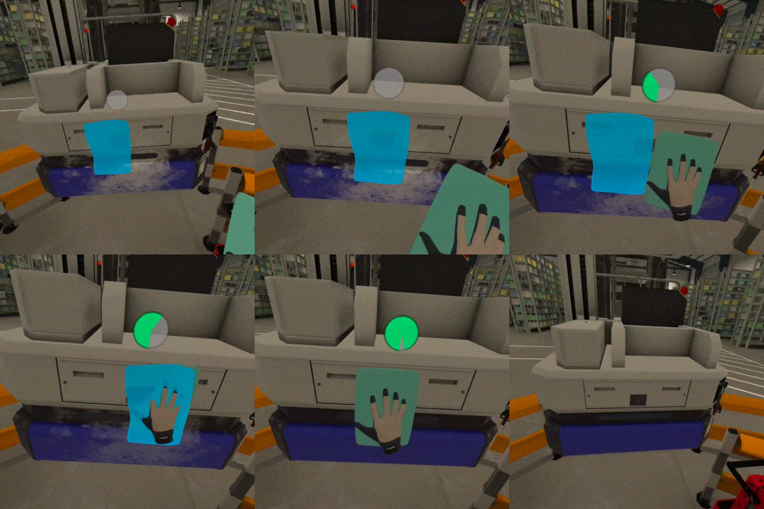
Once the dust clears (or flour, in our case), the user gets to work. The attention grabbing premise has created a “Mouse Trap” board game style series of slapstick damage which must be remedied by the user. Dust has obscured the camera, which must be cleared off. The obscured camera caused the robot to crash, requiring a replacement of the robot’s camera unit. Installing a new camera requires calibration.
These types of things are potential day-to-day responsibilities of a Robotics Specialist, though usually without such a dramatic unfolding. Research was conducted alongside an Instructional Designer and Subject Matter Expert in order to know what types of tasks we part of the job, and these specific actions were chosen in order to facilitate an engaging, memorable learning narrative. These tasks were the start of the design, from which ideas and requirements then worked backwards. The flour-based crash was not the beginning of the design work, even if it is the beginning of the experience.
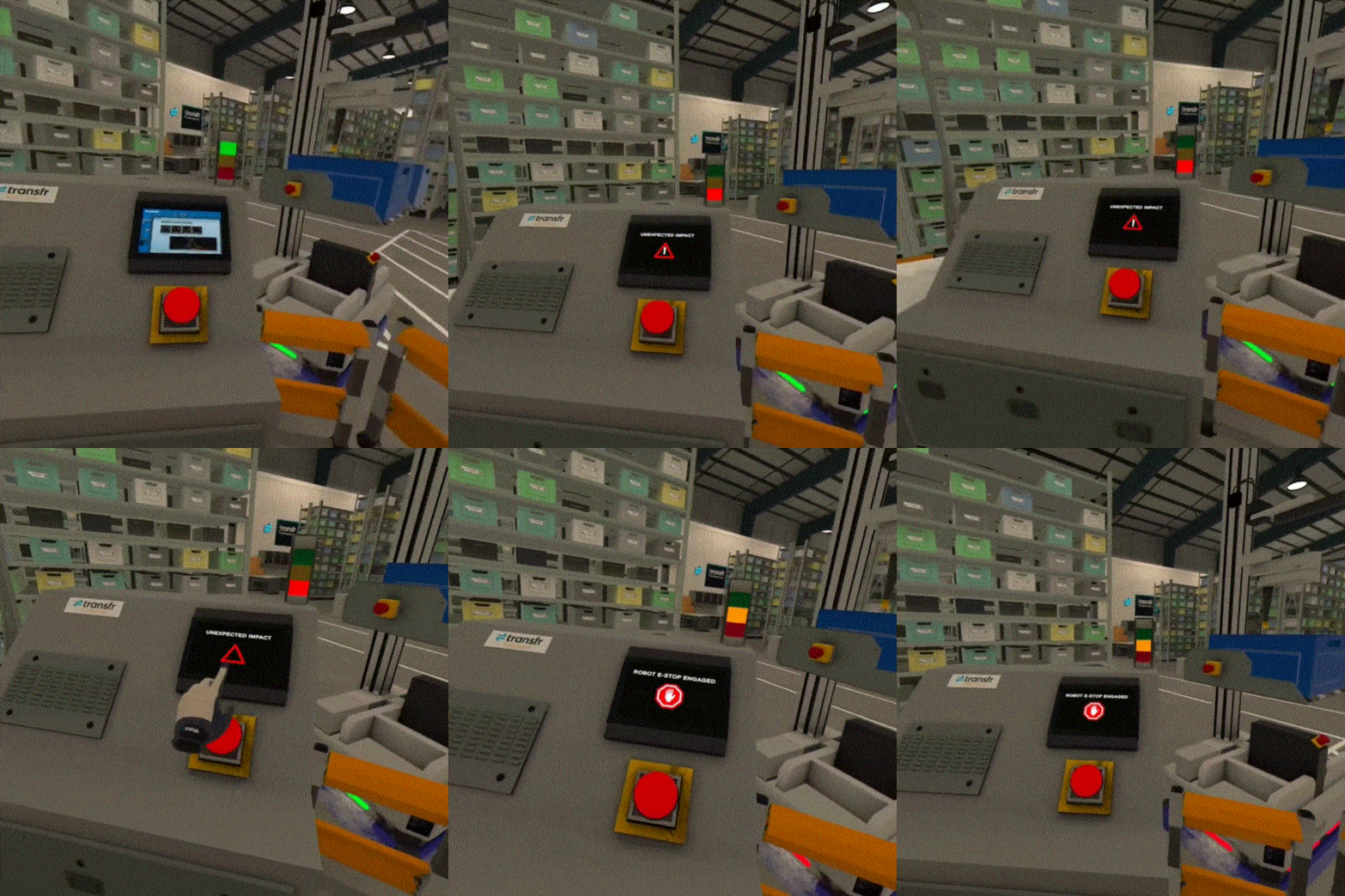
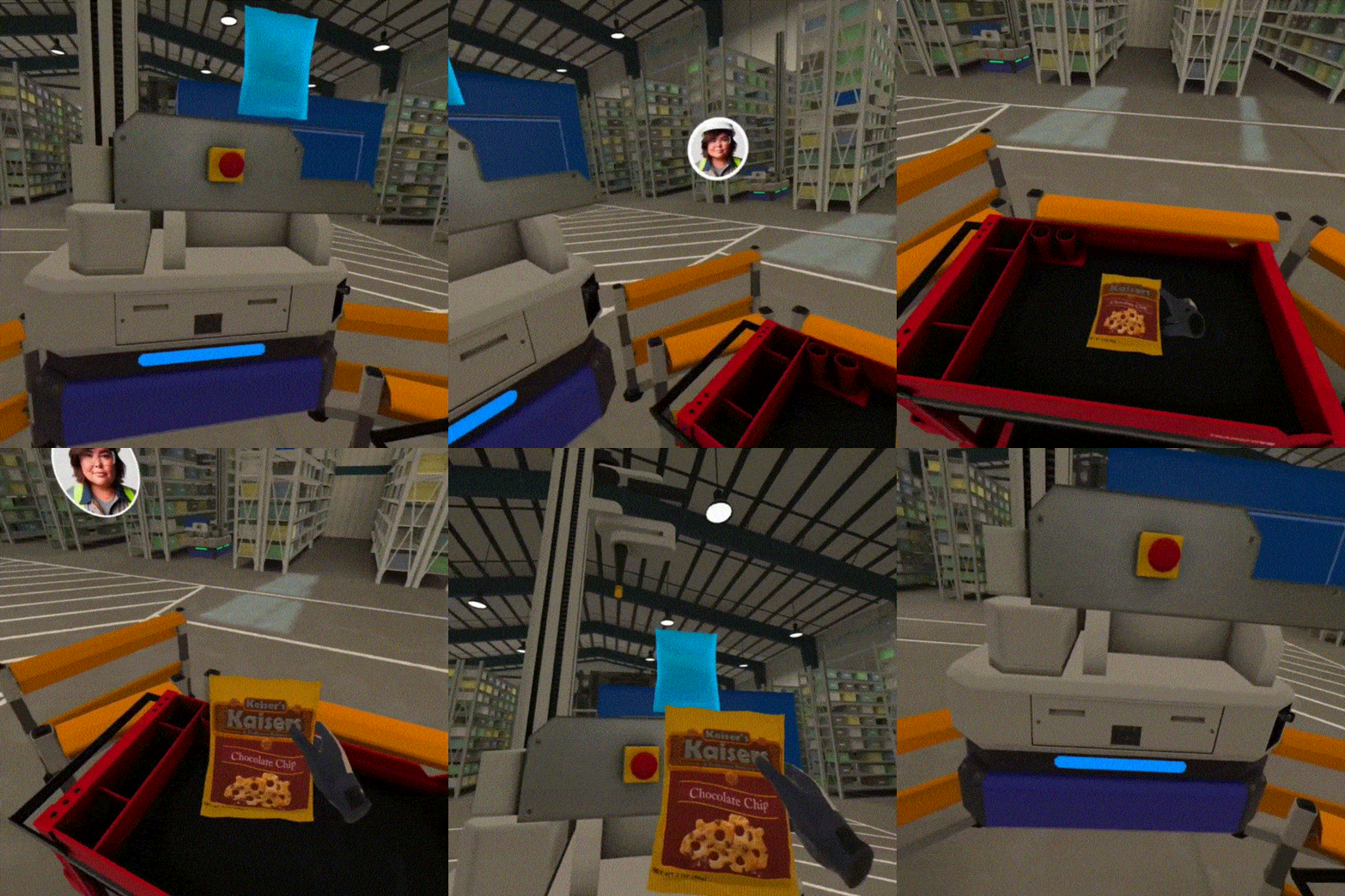
Once we get to the robot maintenance actions themselves, I was determined not to lose the immersive momentum. While some interactions can be fairly simple, there are always approaches to making certain actions juicy and joyful. This can be extra attention given to the satisfying “thunk” sound of pushing a big red button, or the playful tossing of a bag of chips into a bin like a basketball into a net.
Technical Implementation Servicing Design Vision
But achieving a joyful interaction requires technical skill and attention. The emergency red button needed iteration on its hit box, animation, and sound. The bag of chips started as a more fully simulated ball game which then needed to be pivoted away from. Keeping the audience and product in mind, a more ‘bullet proof’ approach to both was warranted.

Heightening the emotion of the emergency stop scenario was important for learning and immersion. In reality, the emergency sounds and notifications endlessly loop until the user presses the big red button. But having a player being potentially stuck inside of that game state loop would not only be stressful but simultaneously deflate the felt urgency and overall immersiveness.
Tweaking the button’s hit box to be generous enough to provide an easily “slappable” interaction that is as reliable as possible was important. But if the hit box was too large, a player doesn’t really feel like they are slapping it, or even worse, the successful hit feels like a jumpy glitch that confuses the player. Finding the ‘sweet spot’ involved much testing and opinions of teammates.

The ‘bag toss’ interaction was actually born of some technical disappointment at first. Our team had originally hoped for a more fully simulated ‘ball toss’ mechanic, where the bag needed to be fully thrown into the basket in a realistic manner. This proved a little fussy, and given our non-gaming audience, we had our concerns about tying narrative advancement to something potentially frustrating. Though, there was still a bit of disappointment at the cut, so I worked on a goldilocks approach.
The final interaction allows for the bag to be manually placed at the very edge of the basket.. The bag placement is above the player’s head, allowing for a satisfying arm reach that provides spatial variety, and a gesture of exertion. However, if the player wanted to actually throw the bag at the successful target area, they could do that as well. In either case, upon successful placement, the bag just tilts and tips over the edge and falls inside via an animation.
Again, the understanding of Unity, in-house tooling, and animation principles were all important in creating these ‘effortless’ interactions that not only ‘just work’, but have enough interaction juiciness to provide a bit of interactive satisfaction to the player.