For this week’s lab homework, we were asked to create a simple application using digital or analog input and digital output. Since we were working on analog input in class, and already worked on button press input, I was interested in getting some more detailed input besides on or off.
I wanted to do a little “LED Meter” that could visually measure analog values. This way, I could plug in different kinds of sensors and immediately see feedback on if they were working or not.
LEDs! More LEDs! More more more!!!
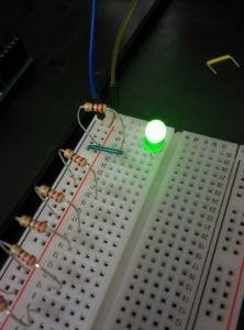
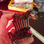
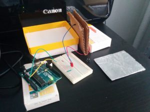
I populated my breadboard with 8 LEDs, with the 8th and final LED being green. This would represent hitting the ‘top’ value.
Then I added a potentiometer with a knob to control the lights:
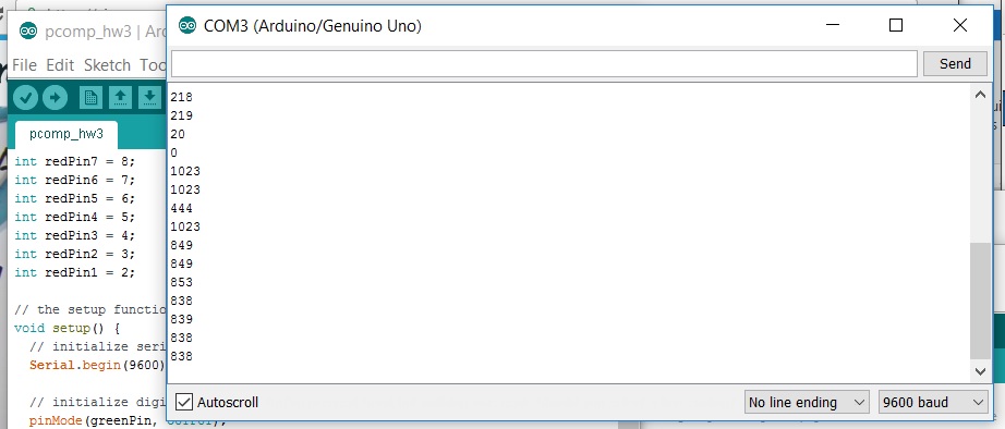
Yes, yes, I know my hand is in the way. I definitely had some issues with ‘jittery’ values. After playing around with the jumper wire, I developed a strong sense of superstition and paranoia about how I was touching my piece. Bumps and jostles seemed to produce ‘floating inputs’ as described in class:
0? 1023? 404? Back to 1023? Not what we want.
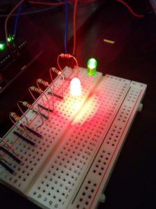
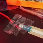
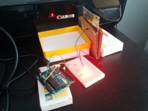
I wanted to move on and play around with a force sensitive resistor that is laid out like a strip. I changed up the code for the lights to more clearly depict a ‘position’ within the interaction paradigm. More or less pretty fun interaction as I had imagined it:
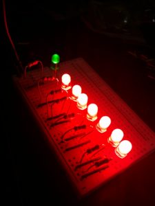
However, it seemed like my noisy, floating input issues were even worse while trying to set this up. From what I gathered, it didn’t seem like an issue with the circuit plan, but implementation.
At first I went with alligator clips to clip onto the FSR leads, clips to wire, wire to bread board. It worked ok… until I slightly nudged it and it all went to hell. Then I decided to use some special male to female jumper wire I bought a while ago. Which definitely seemed to help, but not all the way. Still needed to implement a sophisticated solution to reduce movement. That is to say, cover everything with tape.
After all of that, though for the most part better, I was still having issues with jumpy input. I managed to refine my code to exclude some of the lower, less reliable values. But I definitely will be asking in class about ways to securely connect sensors that don’t easily plug directly into the bread board. I was going to have a little more fun with this one, but the fragility of the system prevented me from moving the arduino/breadboard/sensor system around as needed.
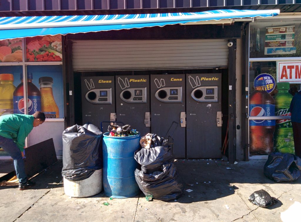
We were asked to critique a public technology interface for our PComp homework. I chose a set of public facing glass, plastic and aluminum can recycling machines.
The broader shot of these machines is important for a few reasons. When you put in your recyclable items and finish, you are given a paper receipt. That receipt is redeemable at a grocery store to the left of the machine bank. Many people bring multiple kinds of items, meaning that they weren’t just using one “glass” or “plastic” machine, but might go from one to the other. All of this takes place on a larger than usual New York City sidewalk. The white and blue plastic barrels are almost always there, and reside close to the machines for a reason I will explain later. And finally, as can be seen in the photo, the grocery store has a basement storage entry port directly to the left of the machine bank.
My assumptions for critiquing this interface lied in how well the machine might work, if the buttons and interface were legible, etc. However, the more I watched, the more I realized there was a higher level issue with space around the machines themselves.
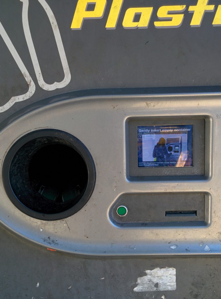
The interface is pretty straightforward:
As you put in items, the are accepted by the machine and tallied in amount on the screen. If there is an issue with the machine accepting the item it spits it back out.
When you are done, you press the green button to get your receipt and collect your money at the store next door.
More or less straightforward. One issue I noticed was that there seems to be some kind of internal limit for each receipt. If you pass that maximum amount, it would spit out a receipt abruptly and start a new transaction. This didn’t seem to phase people who hit that limit, as it seemed they expected it. The bigger issue was when a machine had trouble verifying the item entered, and then rejected it.
Most people seemed to use these machines for around 4-8 minutes. No one used it for less than three minutes, and the longest time was 19 minutes. However, in that particular case, that is strictly machine use. That does not count the wait to use the machine, and then an additional 5 minutes to get the money from the store next door.
There seemed to be more casual users that had less items and took less than 10 minutes, and then users that had lots and lots of recycling that would take longer than 10 minutes.
Everyone has to put in their items one by one, which seemed like the biggest design flaw. Because not only does it slow everyone down, but the people who line up to wait are also taking up lots of space.
The grocery store is next to a subway stop, so space is at a premium. As you can see above, when trying to take discreet photos, it was hard at moments just to get a clear shot. Many people would walk up to these recycling machines to use them, only to turn away upon seeing the scene. I assume this is because of the waiting time, if they saw a user with many recyclable bins and bags, but it also seemed that there was no real space for them to wait with their large collections.
I noticed a user with multiple bags, taking the most time and space 20 minutes into my observation. She started shaking the machine, rocking it back and forth. She knocks on the door the grocery store and calls for an attendant. Someone comes out, also shakes the machine, and then opens it up:
Inside of the machine is a plastic bin with the shredded recycled contents. The man then empties that into one of the big plastic barrels in front of the machine bank, returns the bin to the machine, and locks the machine up. This means that the plastic barrels need to be close enough to the machines for the attendant to dump the contents into them, but that means they are directly in the way of the users. Because many people with large volumes of items use these machines, I saw this process occur two times within 40 minutes of observation.
Also note in the images that the basement access hatch is open, and the user’s cart with big bags attached is next to it. Definitely impeding flow and access to the machines.
There are some interesting workarounds to a machine rejecting an item. Plastic bottles seem to have an issue when crushed too much, so people will put their mouth to their hand, and then their hand to the bottle and re-inflate it, which usually worked. Also, a specific user showed up with rubber gloves. When she had issues getting a bottle to be accepted, she combed through the broken glass bin to find an intact bar code label. She carefully peeled it off the broken glass, spit onto the backside of the label, and then attached it to the other rejected glass bottle. It got through.
On the surface, this machine and its interaction work fine. If you walked up to it with a bottle you wanted to recycle, it would most likely be a decent user experience. You would put in your bottle, and the machine would verify it. If confirmed you could immediately press the only green button on the machine, have a receipt printed out very quickly and walk immediately next door to have it redeemed. If rejected, you could try a couple more times. If it didn’t work after more attempts you would know that it wouldn’t take your bottle and you would move on.
However, the average people who use these machines have many, many items. There should be a more efficient way of verifying them, ideally in bulk or maybe a conveyor belt type system. No one is really using these machines for a few cans. It is a garbage bag full, at least. Every delay adds to the line, which reduces the space, which makes flow more difficult, and all this make users give up before they even reach the machine.
Even users who are done, like the one who took the longest at 19 minutes, can still impede the process through no fault of their own. Because the adjacent basement doors were open when she was finished, she didn’t bother to move her things to the left to go to the store. It was plain to see it would have been too much work, so she just left her things there while she waited for her money.
People seem to go to great lengths to get money from this machine, so it seems like common decency to make the design as seamless as possible. But besides that, I think that there is a class of user that is so familiar with the process that you might be able to make the interface somewhat more complex in the interest of saving time and/or space.
Crawford might call out a an excessive lag in response; if you didn’t account for hundreds of items you might think that a second or two delay in processing was acceptable but in the long term it isn’t. Norman might call for physical affordances that accommodate space needs; making space for multiple people with large carts and multiple stuffed bags. I imagine that both would account for the actual user population’s needs and knowledge level; repeated bulk deposits from repeat customers, not one off small deposits.
Our second assignment for ICM was to include the following three aspects into a p5.js sketch:
One element controlled by the mouse.
One element that changes over time, independently of the mouse.
One element that is different every time you run the sketch.
I wanted to stick with simple shapes and color schemes in order to easily highlight what was interactive and what wasn’t. A minimalist at heart, I decided to go with circles and lines.
The mouse controls the size of the lines and circles, and color of the circles. The mouse Y position controls the color of the circles (the “inner” circles” have the opposite color of the bigger “outer” circle). The X position of the mouse changes the size of the circles; they are paired diagonally opposite in order to avoid circle overlapping when growing.
The X position also determines the size of the crossed lines. This was my one allowed “cheat” to use something new: abs(). This makes any integer an absolute value: any negative number turns into a positive, but any positive stays positive. With a little bit of tricky math, I was able to determine the following: the closer the mouse is to the horizontal center of the screen, the larger the lines, while the closer to the edge of the sketch makes them smaller.
The stroke of the circles changes over time.
The background is a different level of darkness each time the sketch is run. There is a rect with half alpha that sits on top of the entire sketch, that chooses a different color each time the sketch is run. Since everything below is gray scale, this produces a new monochromatic color scheme each time.
A fun error with mouse position:
Gah! Circles, how did you get so big?
I noticed that p5.js was keeping track of the mouse position outside of the canvas itself. This was most dramatic when I was scaling the size of my browser window as the sketch was running, causing the image above. Good to note this behavior, as in the future I’ll have to remember to build in safe guards against unexpected mouse position values (when we get into for loops).
You can replicate the error described above. Simply hovering your mouse over the sketch keeps all variables within the expected bounds. However, while hovering over the sketch and clicking your mouse, if you hold down the mouse button and go anywhere else on your screen outside the sketch’s bounds, p5.js will still keep track of the mouse position. Good to know!
For our first blog post assignment for Interaction Design Studio, we were asked to show two examples of interaction; one that is well designed and one that is poorly-designed.
I’m going to start off by saying that my comparison will be a bit unfair. As a companion reading for our homework, we were asked to look at usability.gov and their guidelines on interaction. I’ll talk more about that later, but for now what I wanted to point out that the interactions being described on usability.gov were all put in context of utilitarian thinking, with specific end goals in mind for specific actions, and what I’m sensing is an assumption of “fixed” use. For example, there may be a priority on giving a user enough information so that they won’t make a mistake, but this takes for granted “mistakes” at all.
With a musical instrument, perhaps not all points of interaction need to be explicitly labeled because “play” might be encouraged. There is no such thing as a wrong note, just pick up the thing and start banging away! If you get something wrong it is fine, just press another button or pluck another string. This would NOT be a suitable paradigm for devices that use lots of high voltage to carry out specific tasks.
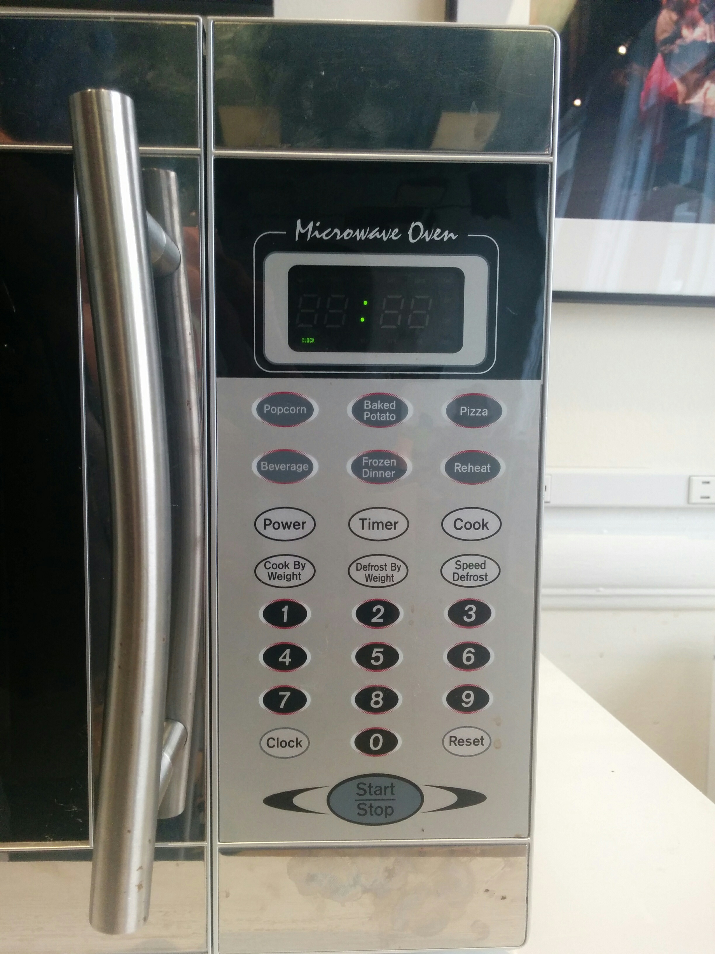
With that in mind, I’m going to compare two different button grids. One is a musical interface, a physical device called the Monome. The other is the grid of buttons on my microwave, but this extends to more or less every single microwave panel I’ve used. A bit unfair, considering the utility of both is different, I’ll admit. But I still have opinions.
The Monome is a physical box with push buttons that have an LED inside each of the buttons. On its own, it does nothing. It is intended to be used as a controller for other software. But also, software can talk to the Monome. Button presses can be sent from the Monome to the computer, but software on the computer can tell the Monome to light up certain buttons at certain times. Before the Monome was released, light up buttons on musical controllers usually corresponded to the buttons being pressed. You might hit a button while drumming with you fingers, and you knew it was hit when it lit up. Or it might be a toggle; where I wanted to turn on an effect to change a sound and the button I pressed lit up when the effect was active and was dark when it wasn’t active. These are fine interactions. And actually, the Monome does these interactions… but only if you want it to.
The user can load different programs on their computer to change the way that they interact with the Monome. There are programs that play notes depending on a “bouncing ball” set of rules:
Because it has no fixed function, the Monome’s physical face is just a grid of uniform buttons without any text at all whatsoever. No use labeling buttons when the function of a button can change whenever you want it to. We were asked to watch Objectified as part of our homework:
Dieter Rams talks about taking things away, making things as simple as possible and adding nothing more. I think that the Monome might be the music controller that Dieter Rams would design.
Since it’s release, many have hailed the Monome precisely because of this. A minimalistic design that gets out of the way of the performer, instead of the endless amount of knobs, buttons, sliders, and switches… let alone computer screens that can go along with them. It set a trend in musical controllers, later to be mimicked by Novation, Livid Instruments, and Ableton. The decoupled button and light combination seems to resonate with people trying to interact with their computers in a novel way.
Moving from that grid of buttons, to another more common grid of buttons.
Bad Interaction: Microwave panel
My microwave works the way it works, in a manner that is mostly similar but not quite exactly the same as the microwave I had before I moved and got a new one. Which works in a manner that is mostly similar but not quite exactly the same as the microwave that you use. Which works in a manner that is mostly similar but not quite exactly the same as the microwave that was the one you grew up with. And so on and so on.
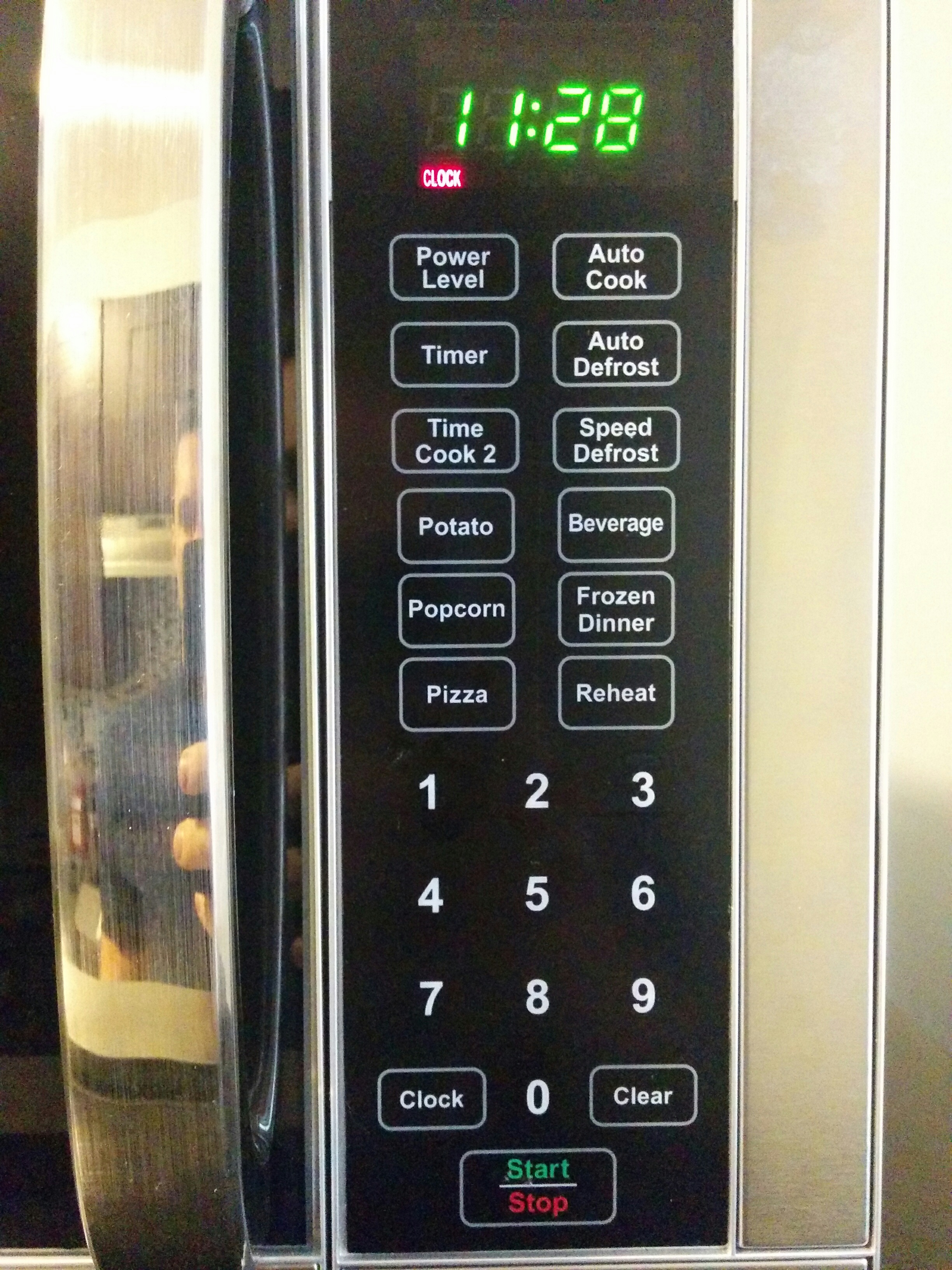
A microwave needs to heat up food for certain amounts of time. Hence, the most commonly used buttons are the number buttons. These let you enter an amount of time for the microwave to run. Then a start button, and a stop button. A physical button opens the microwave door. Then comes a menagerie of other buttons. Many, if not all, of these buttons are ever used. I’m not sure if any of these extra buttons are ever consistent across brands. My new microwave, your new microwave, my old microwave, your old microwave. They’re all a little bit different. The microwave in the ITP student lounge, for example:
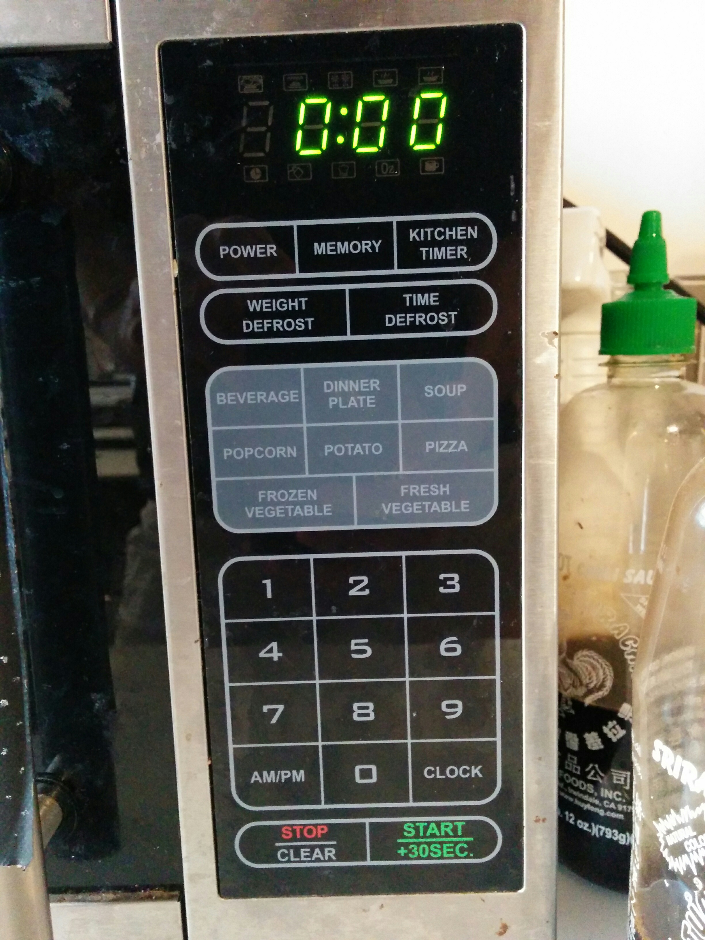
Offering settings for specific foods is popular, but each panel has its own ideas about what you should be heating up. Sometimes we see “Baked Potato”, but here we see “Potato”, which apparently as far as this microwave is concerned is not a vegetable, which have their own frozen and fresh settings. “Dinner Plate” is insanely vague, and even if I’m using an educated assumption of using this setting for a scenario like reheating Thanksgiving dinner leftovers, how is this that much different than the “Pizza” setting? What if my pizza is on a plate? Is it one slice of pizza, or more?
Popcorn the closest thing to the microwave’s greatest hit, but I don’t think I’ve ever used a popcorn button on a microwave and been happy with the result. It is either too much or too little. I get the feeling that most people have the same experience. And in the smoke and ashes of one bag of burned popcorn too many, we are made cynical to the world. I don’t know anyone who expects any of these food-based pre-sets to work properly. So what do we do? We punch in a number, press go, and either put it back in when it comes out too cold or abruptly punch the eject button when we smell burning or see our soup bubble over its container like lava rolling through Pompeii.
I don’t trust you, microwave. I’ve been hurt before. And this is where we can look again at usability.gov’s guidance: Are you following standards? In short, I’ll say no. But really I’m not sure if there are any standards on microwave interfaces. No standards. Bad usability.
So, if we refuse to admit defeat to the microwave, and want to become microwave users of discriminating taste, we might play with the power setting. Because really, that is all any food preset is doing: calling up a preset amount of time to run the microwave at a preset level of intensity. Thankfully, microwaves let us adjust the power manually. How do I do that again?
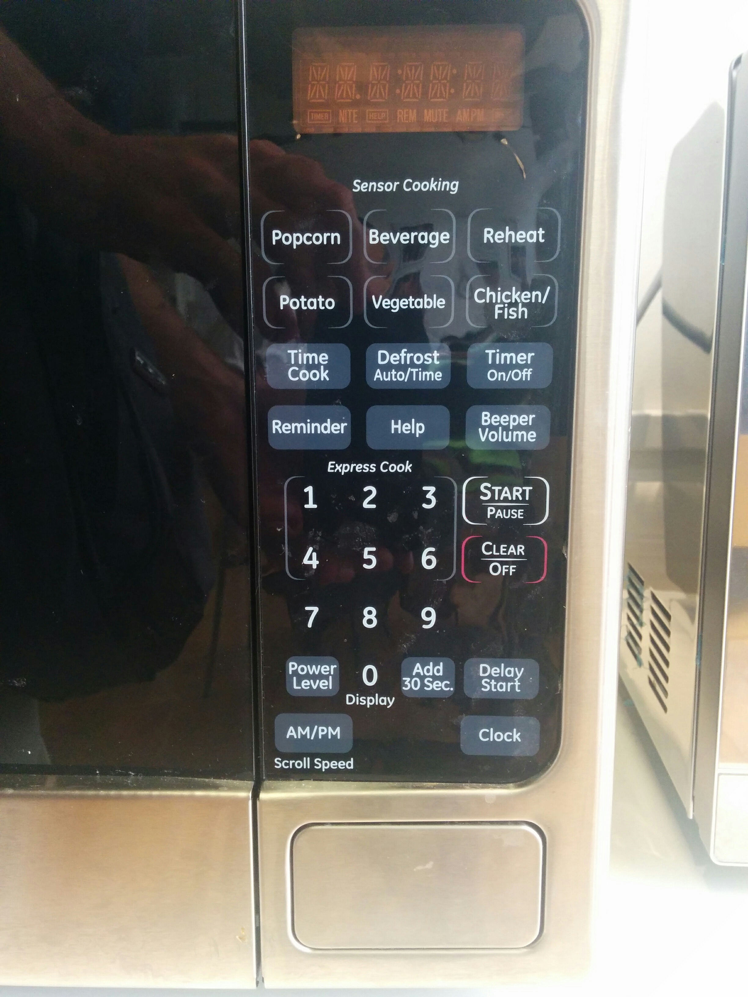
Again, NO STANDARDS. At this point, most people are willing to settle on letting the machine run at its default power and adjust the cooking time. This makes at least half of the other buttons on a standard microwave functionally useless. But we are determined connoisseurs of microwaveable delights and we demand precision. And my Amy’s frozen enchilada is very insistent that I use only half power for 5 minutes before ramping up to full power for a final minute and a half. So for our sake and Amy’s, let’s figure this out. Back to my microwave:
Beeping. Good god make the beeping stop.
“Do error messages provide a way for the user to correct the problem or explain why the error occurred? Helpful error messages provide solutions and context.”
Oh, usability.gov, what a sweet naive world you must live in. How about we start over and ask, “Do error messages distinguish themselves from any other message?” In the language of the microwave, the answer is no. Have you pushed a button? Beep. Have you entered a new mode? Beep. Have you made an error? Beep. Have you not made an error? Beep. I have no idea why there aren’t different kinds of beep tones on microwaves. The correct way to change the power (on this microwave) is to enter the time first, and then press the power button in order to adjust the scale from 0 to 100, and then press start. However, if you may think that you set the power first and then enter the time, you get beeping. But there is no visual feedback that anything has happened. Because this beeping seems the same as the “congratulations, you just pressed 3” beeping, and the “let’s heat up this enchilada!” beeping, you can’t be sure if what you did is right or wrong. So, with the microwave’s blank stare waiting for further action, you might be tempted to press a button in order to adjust the power. That number will come up, but you are entering the cooking time and not the power. I managed to figure it out eventually after some trial and error. “Maybe hold the power button then press a number button?” “Beep.”
Ultimately, I noticed that two beeps meant error, and one meant success. I’m not sure if there is any inherent logic in this, and it took me at least a dozen beeps to notice that was the case.
I could go on, but for the sake of brevity I’ll leave it at that. Again, I’m being a bit harsh on the microwave. I’m not going to be freestyling my next ambient masterpiece on the Sayno in the ITP lounge (it only makes one beep tone anyways…), and I may just be cranky from hunger while waiting for my enchilada to cook, so I’m willing to give these things a bit of slack. But in comparison to the Monome, even though the microwave grid of buttons has explicit labeling, use and functionality isn’t very intuitive. At least with the Monome, you can look at it and instantly know that you don’t know the function of the buttons yet. This can prompt play and natural discovery. With the microwave, you are getting instructions but they aren’t good ones. It is the difference between being able to freely explore in a big happy field, and taking a trail where the signs don’t always say where they are actually pointing to. This reflection has been very interesting to me. Even the humble button, with what might be the simplest of interaction language (“Bang this thing, and this other thing happens”), can still have wildly different approaches and needs depending on activity and user.
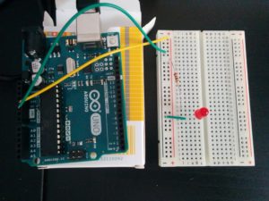
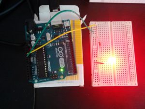
This week’s blog for physical computation was a request to document our lab work. After having gone through the basics of electricity flow and Ohm’s law (and maybe re-reading some of the concepts a few times…) we have started turning on LEDs, and are moving into making switches. But before we get excited about all the shiny possibilities, let’s set up our board properly.
What is the equivalent of “Measure twice, cut once,” but for electronics? Benedetta has done a great job warning us about consistently removing the power while working on our circuits. First, I want to make sure that my LED lights up without too much juice, so I have the trusty ol’ 220 Ω resistor protecting it. And with power, it lights up.
Now we can add a button in the middle of this chain and to see if we can create a light switch.
And the test…
Success!
Now that I know the LED can turn on (without any smoke or funky melting plastic smells), and get toggled on and off with a normal push button switch, I went about to creating my own switch type mechanism.
I like the idea of switches that aren’t necessarily buttons or levers or toggles. Conductive surfaces can allow for a kind of “presence” sensing that is effectively seamless. I came up with an idea of a switch that might work like an ID that you would dip into a card reader. When the ID was successfully entered into the machine, a light would confirm.
Materials: card stock wrapped in tin foil, a folded piece of cardboard, some tape, and some wires to bring signal back to the breadboard. I assumed that tin foil was conductive, but just to make sure I wanted to test. (Who am I kidding? I just wanted to try out my fun new multimeter)
Next, the wires are placed where the switch was. Coming off of the resistor, one wire is punched through the bottom right of the cardboard enclosure. Then continuing onto the LED, one wire is punched through the top left of the cardboard enclosure. Differing heights and sides made sure that the two wires would not accidentally touch each other on their own, complete the circuit and create a ‘false positive’ for lighting up the LED.
Fun stuff! Easy to forget that you can make all kinds of interactions with tape, paper and foil. After I made this, I definitely kept thinking about all the different variations and elaborations that are possible when working from this basic concept.
For our first assignment in ICM, we were tasked with making a screen drawing using the basic drawing functions of p5.js. I decided to use the 2D primitives and basic color functions to create my own take on a Morrocan tile pattern (or something like it). These are pretty geometric, so to incorporate the curve() drawing function I decided to “sign” my name at the bottom with my first initial. This also used a different color mode that includes alpha information, giving a kind of “watermark” effect to labeling my authorship visually.
I have experience with coding in general, and have Processing and Javascript experience. However, despite playing around with Processing for a while, I only ever really “finished” one real project. I haven’t done much serious coding in Javascript in a long time, either. I didn’t have any major pitfalls in creating my homework piece, and was able to figure out everything I needed to do. A great part of this was the web editor, which was very responsive when the “Play” button was left on while I coded. I appreciate the “live coding” environment for visual programs, as it helped me (kind of) wrap my head around some of the trickier shape functions like arc() and curve(). It was smooth sailing for my first assignment, so I didn’t post any issues to github.
But it was good to shake off the cobwebs. It seems like no matter how long I have coded, picking up a language I haven’t used in a while requires me to get reaquainted with it. Javascript seems to have the habit of doing things for you and filling in the gaps on its own instead of stopping everything. This can be great for getting things to “just work”, but can make for some unexpected behaviors.
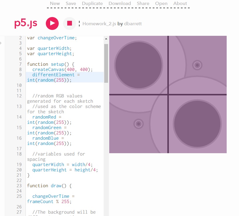
For example, I was coding along, throwing up shapes on the screen. I was looking at the different functions I was asked to incorporate into my assignment, and decided I should change the stroke weight of the next shape. When I did that, all the other shapes changed their stroke width! Why? They already had strokes?
It seems that just because you are setting the stroke color, which creates a default stroke width of 1, that does not mean that you have explicitly set the stroke width to 1. Additionally, if you use a basic color function only once in your program, it applies to all the 2D primitive shapes, even if the command is called after those shapes are drawn. Simple example here:
Notice, all shapes have the same stroke weight, even the ones “before” the stroke weight call
I’ve dealt with quirky behaviors like this before, so once I saw it I knew that I probably needed to explicitly set that color function at the top of my code in order to return it to what it looked like before. Still, confusing for a moment and a reminder of how unexpected behaviors can blindside you when you are gaining momentum in writing a program of certain length. Sometimes it isn’t what you just wrote on the last few lines that caused the error, but what you wrote on the first few lines when you started (or didn’t write, in my case).
Here is the code to my sketch here for people to look at:
And after a bit of playing around in WordPress I figured out how to embed p5.js sketches into a blog from the alpha editor. Without further ado, my homework:
In terms of applying computation to my interests, I’ve had a pretty broad faith in being able to use technology for artistic expression. I welcome any opportunity to grow my coding skills in the service of creating art of any kind; visual, audio, textual, interactive, physical, etc. In terms of setting some solid goals for this semester, I would like to develop some interfaces in p5.js that might be able to be used for live performance of music, specifically something that might be able to leverage Chrome’s MIDI capabilities. I also have had a specific idea for a text/sculpture piece referencing Italo Calvino’s “If on a Winter’s Night a Traveler”. Not sure how in depth this blog post should get, but I can elaborate on the specifics of that idea later if desired.
I also have a desire to be able to teach this kind of creative coding. I’m hoping to learn about that process by taking this class, and hopefully being a resource to my fellow classmates in order to familiarize myself with different ways people come to learn code.
In terms of the ICM Inspiration Wiki page, I’m always happy to be reminded of Oblique Strategies! The game itself linked there didn’t seem to function (a server error of some kind), but Oblique Strategies can be found in many different forms and is a great way to get the mental juices flowing. Jerp Thorp’s work in making a Processing program that helped arrange names on the 9/11 memorial always struck me as moving; creative coding doesn’t always need to be flashy to be emotionally effective. Ryoji Ikeda’s superposition strikes me as great, because it brings the concept of “operators” into a choreographed and performative context. Not quite “the man behind the curtain” but not an upfront performer who is the center of attention, either.
My addition to the page was Anna Anthropy, her interactive work Dys4ia and her book Rise of the Videogame Zinesters. Anna is a indie game developer, but some of her work straddles the divide between game and “interactive narrative” (if there is a distinction to be made between the two). Anna is transgender, and Dys4ia is an autobiographical depiction of her transitioning process. Rise of the Videogame Zinesters is a kind of manifesto for DIY game development, an endorsement for accessible development tools, and a call for more “personalized” game development that empowers everyday people. I feel like there are a lot of parallels with this ethos and the intent behind libraries, frameworks and projects like Arduino, Processing and p5.js; making it easier for everyone to make digital art. Rise of the Videogame Zinesters is a quick read and a kick in the pants. If this doesn’t make you want to drop the excuses and start pushing some pixels around for art’s sake, nothing will.
I was so happy to see a common theme here: remix, sampling, appropriation, copyright, intellectual property, influence, the commons, art, originality. I’ve long thought about these topics. Some books that have influenced my ideas on this: Anarchist in the Library, by Siva Vaidhyanathan and Free Culture: The Nature and Future of Creativity, by Lawrence Lessig.
Being new to New York, I was happy to go on the East Village Poetry walk in order to get to know the neighborhood close to our school. But to also reacquaint myself with famous poets and writers that I am somewhat familiar with, and put them in their physical context within the new city I will now call home.
The audio tour was wonderful. Entirely immersive, while simultaneously making me hyper aware of everything around me. Usually great immersive art makes you lose track of the real world, but the audio tour put one of my feet in immediate reality and my other foot into a different world I was totally lost inside of.
I hadn’t thought much about walking tours before. But I greatly appreciate the form, now. I’ve already sent the link to a friend! This has made me on the look-out for other good ones.
I wound up doing the walk before watching the video and doing the reading, which I think was a good order. “Embracing the Remix” conjures up modern methods of artistic re-use: digital audio sampling in dance music, mashups, maybe some wild and bizarre video art. However, having just walked out of an auditory time machine, these concepts felt far more old, established, and anchored in the artistic landscape. How can we be scandalized by Danger Mouse’s Gray Album when William Burroughs was doing his cutup technique forty years earlier? How far away is sampling a James Brown drum break from the folk music tradition?
In my experience, these types of meditations are very useful when trying to expand people’s understanding of intellectual property. Infringement is usually cast as a new, digital interloper that is smashing the established order. I was delighted to see Jonathan Lethem bring up the concept of “The Commons” in his article, which is also heavily featured in the books Free Culture and The Anarchist in the Library. We’ve had structures of ambiguous ownerless-ness that serves society since the middle ages.
I love Lethem’s casting of language as a kind of commons. Never thought of it in that way before. However, I don’t think that this awesome feat of philosophical acrobatics is even required. Take the plain, original physical commons: a piece of land that the community’s farmers could all use to for their livestock to graze on. A piece of property used by all that is owned by none. It lies outside of what would normally be a capitalist (and at the time, feudal) structure of ownership.
From the lords to the peasants, the value was obvious. They didn’t need 21st century graduate philosophy courses or economic statistical models to understand it. It was a natural, intuitive way of casually organized sharing that benefited everyone in the town. These ideas aren’t solely the theories of lefty digital radicals with their MP3s and their hip hop. They are the completely plain deduction of an English farmer from one thousand years ago.
And once you’ve given people a kind of “meat and potatoes”, “salt of the earth” challenge of intellectual property and copyright, you can move on to the instances where it hides in plain sight in the present day: libraries. Again, we could go on to be high minded about this, but I like to make it plain. If you had never heard of a library before, you might think that creating one would bankrupt book stores. However, this didn’t happen. And even if we decide to give the devil his due, and perhaps admit that the existence of a library could represent a non-zero amount of money lost for book sellers… we simply do not care as a society. Whatever that cost is, we have decided that the value of the library (a kind of intellectual commons where the community can graze on knowledge) is simply greater than not having a library.
But these things are normalized to the modern citizen. We don’t view them as “new” things, but as institutions. They don’t seem challenging at all. But they aren’t “inherent”, they are decided upon by members of the community. This is why we see campaigns by vested interests to influence our opinions on such things, as Lethem points out in the “You wouldn’t steal a handbag!” MPAA anti-piracy commercials. The MPAA wants to make us feel that the digital equals the physical. That one MP3 downloaded illegally inherently equals one less song somewhere else in the world, and hence a lost sale, and theft.
I love reminding people that the digital isn’t physical, the concepts of “lost sale”, and so on. But I would also like to attack this target from the opposite direction. Namely, that our understanding and categorization of physical ownership is not itself set in stone or inherently fixed either.
In the introduction to Free Culture, Lawrence Lessig talks of the early days of flight in the United States. Building upon the knowledge of the Wright Brother’s innovation, a budding aviation industry spread its proverbial and literal wings. Up until this moment, US property law described ownership of land as not just the surface of the plot but also “an indefinite extent, upwards.” Lessig points out the obvious hurdles this put in front of newly flying aircraft: was a trip over someone’s farm considered trespassing?
This was tested in the Supreme Court when a farmer sued the US military for flying over his land. The noises from the aircraft scared his chickens, who would fly into the walls of their coop and kill themselves in panic. He was suing in part because the planes were trespassing, as ownership of his land extended above his property “indefinitely”.
I will condense the conclusions, but I encourage everyone to read Free Culture as it really is a great and accessible read for everyone. Essentially, the Supreme Court rules against the farmer and in one fell swoop redefines property rights fundamentally. No, you do not own the air above your property “indefinitely upwards” anymore. The reason? Entirely pragmatic. This new invention of air travel is simply too important to be held back by this definition. So for the sake of letting this innovation flourish and hence increase the common good, we will redefine what it means to own something physically. A wave of the hand and a commons of the air is created, simply because it is obviously a good thing. We make these changes, bend these rules, and tolerate what might in some way be considered a transgression, because at the end of the day it is simply worth it. What is best for everyone? America gets a cultural value out of folk music, with its casually anarchist traditions of copying and ownership. On the East Village Poetry Walk, you could see the added benefit it gave: by allowing beat poets to continue on in that tradition and “steal” from folk, in its content and ethos.
And this is great, and many could be heartened by this cultural history lesson. But it doesn’t have to stop there. If we take an even broader and more practical view, folk is not just also the beat poets (and hip hop, and dance music, and Danger Mouse, and onward into the musical tradition). Because of our flexibility and pragmatism and desire for obvious common good, folk is a library. The beat poets are airplanes. And based on our readings, the remix is a new smartphone or maybe even the cure for cancer.
Love this stuff. Great first reads, views, listens and walks for this class. Very excited at where this all is pointing towards in terms of our work and conversations for the next class.
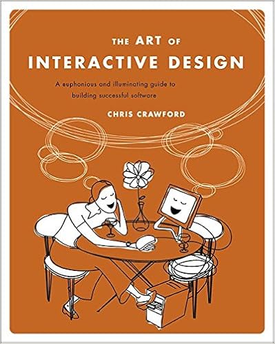
For our first Physical Computing reading, we were asked to respond to Chris Crawford’s first two chapters of his book “The Art of Interactive Design”, and then a blog post from Bret Victor titled “A Brief Rant on the Future of Interaction Design”.
The Art of Interactive Design: A Euphonious and Illuminating Guide to Building Successful Software, Amazon Link
What great readings! I found myself questioning my understanding of the concept of interactivity. Crawford seems correct when he says the word can be used carelessly, and I’m sure all of us in class may have a bit of fun critiquing each other’s definitions. Most likely because the word gets thrown around so haphazardly, as Crawford points out. Since we are in the Interactive Telecommunications Program, it seems worthwhile to define our terms (or at least investigate them).
Crawford’s cranky tone initially put me off, but he reveals the comedy in it with a great pace. He is opinionated, utterly convinced that he is objectively correct, but by the end of the first chapter is willing to let someone else step in with their own opinions and is willing to accept that he may be wrong.
This can be funny in one sense; “I am 100% correct and anyone who disagrees is objectively wrong… but what do I know? ::shrug::”. It is funny to make such an abrupt change. But I think it may also point to a broader point: there may be a certain amount of potential ambiguity about what “true interactivity” is, but if we’re going to roll up our sleeves and start building we should have some solid frameworks about what we should be trying to achieve. Make some definitions so we can focus on them and not get distracted by things that lie outside of that definition. Essentially, maybe at the end of the day these things are more “subjective”, but we benefit from treating them as if they are “objective” and fixed even if we know that they aren’t. Crawford isn’t necessarily contradicting himself, I think he believes both at the same time.
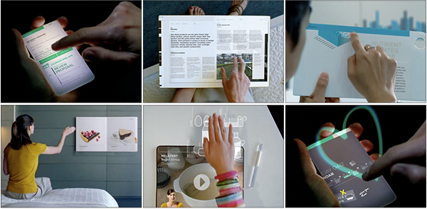
Bret Victor’s post was also very enlightening. It is easy to get wowed by “visions of the future”, especially with such slick production values as the Microsoft video he linked to. To watch that video first and then have Victor pull the rug out from under us is entertaining. So much of what we think of the future isn’t fantastic enough. Exploring a little bit of the history of tech speculation was great, and exposing the through line of the Microsoft concept demo was insightful interactivity critique. The current zeitgeist is “pictures under glass”. Such a succinct way to describe it.
“Pictures Under Glass”
I read Crawford first, then Victor. Crawford emphasizes his “Listen, Think, Speak” model of interactivity. To exclude things he says aren’t interactive, he uses the example of a rock. Just because you throw a rock and it makes a sound, doesn’t mean the rock is “interactive”. While reading I was taking notes and at this point immediately wrote down “book”. Would Crawford think that a book was “interactive”?
Sure enough, he went on to talk about books, but used what I thought was a bit of a strawman argument. Essentially his argument is, “Some say reading a book makes you have emotions, which they falsely describe as author/reader interactivity”. But that wasn’t what I thought of at all. And then when I read Victor’s blog post article, there it was:
“Notice how you know where you are in the book by the distribution of weight in each hand, and the thickness of the page stacks between your fingers. Turn a page, and notice how you would know if you grabbed two pages together, by how they would slip apart when you rub them against each other.”
I was having trouble putting my feelings into words, but I think this is what I was thinking when I thought of a book being interactive. But is that “true” interaction?
Crawford’s definition certainly seems to orient itself more towards computers and digital technology when he uses the term “think” in his second step of interaction. A book doesn’t think. A rock doesn’t think. Not interactive. But what about a drum? A guitar? A piano? It is hard to say they “think”. And at the end of the day, when you use them you are more or less just hitting them in certain ways. Maybe not so different than throwing a rock. But are we really ready to say that a piano isn’t “interactive”? A piano can “listen” to the finger motions of the user, then might be described as “thinking” via the internal physical arrangements that are carefully placed to process the intent of the fingers, and then “speak” to the user by delivering the sound outwards.
Would Crawford think I was cheating? Or are the fingers simply hitting keys, and the keys pulling hammers, and hammers hitting strings? A cascading of rocks hitting things and making noises?
With all of this in mind: the homework questions.
How would I define physical interaction? When describing the listen/think/speak system for defining interaction, Crawford mentions that “think” is being used purposefully instead of “processing”. I might propose putting it back in: listen/process/speak. This might avoid some of the tangles when thinking about “analog” interactivity. Though, like Crawford, I’m ready to hear other opinions and change my mind!
What makes for good physical interaction? While Crawford warns us against conflating reactivity with interactivity, I think that reacting/response is at least a component of interaction. High quality responses seem to make for good physical interaction. Utilizing appropriate senses, maximizing amount of appropriate information delivered, minimizing time delivering information, all strike me as “high quality” responses.
Are there works from others that you would say are good examples of digital technology that are not interactive? This question was a little tough since my head is still spinning between Crawford and Victor’s thoughts. For now, trying to stick a little bit closer to Crawford, I mght use the example of a 3D printer. It doesn’t really “interact” with the user, as much as perform clockwork motions by rote instruction.
Yesterday was the first day of class for me and my fellow ITP 2018 classmates, and for some of us Applications was our first ITP class ever. It was very special, as Nancy outlined some of the history of ITP. Red Burns seemed like a very visionary and special woman. Many of us in ITP have discussed how it can be difficult to explain what ITP is to our family and friends, and I think that talking about what Red Burns did is a really good way to start. This isn’t from the lecture we had in class, but I think it is a good entry point to her history of founding ITP:
Nancy read a short speech by Red while making some small asides about the references, and my page of notes started filling up. Things I wound up googling after class: Keat’s concept of “negative capability”, Thomas Aquinas’ concept of “scandalous curiosity” (re-purposed as positive instead of negative, though it seems that there is a kind of a dialog between Aquinas and Augustine in regards to this), Geoffrey Pyke, and Bruce Springsteen’s SXSW talk on artists that influenced his career. A link to the speech and transcription can be found here:
We were also given a small booklet of Red’s speech. I’m making sure to keep this in a safe place and cherish it. It was a very kind gift from the ITP staff. Thank you.
This was the introduction, which from now on will be the part of the class where selected classmates give presentations in response to the speaker from the previous week. This week’s speaker was Carter Emmart, Director of Astrovisualization at the American Museum of Natural History. He showed us a piece of software he developed over years to display at the Hayden Planetarium. There is a TED talk where he shows what it can do:
The software is called Uni View. This can take current data sets from NASA to perform its visualizations, so the earth we were seeing in class was photographed the previous day. He could access different data sets in order to view celestial bodies differently, for example we were able to look at the moon up close using photographs taken from the first moon landing and examine Mars using images from specific fly by missions.
He also talked about how an open source version was in development called Open Space, which was very encouraging to hear.
In the TED talk, and during the lecture, you can hear Carter engage in a sentiment that is commonly echoed in the space community. This sentiment is that looking at earth from afar makes humans feel a certain kind of bond to their fellow man, appreciate the fragility of our only home, and take a ‘larger’ view of the world and our existence in it. You will find all kinds of memorable quotes from astronauts who talk of this feeling. When I need to reference this concept in short hand, I call it “the pale blue dot” phenomenon. Carl Sagan gave a speech that sums up a lot of this emotion:
There are other presentations that can invoke similar feelings, like the innumerable “orders of magnitude” type videos that can make earth feel so small and give us perspective.
One of the things that I noticed about Carter’s presentation of Uni View in our class as opposed to the TED talk was the improvisational quality of examining the program. He would flick the constellation lines on and off. He would load the data of various space probe paths and on his way to look at them, get distracted and decide to go to the Moon. Then he would zoom in and talk about what the astronauts who flew over this mountain range said they felt when they approached. But almost as an after thought, he would say, “Oh yeah, let’s load those images from 1972 instead of the most recent!” He would get so close that he would glide past what he wanted to talk about and have to carefully re-orient the camera. What was the camera oriented towards before this? Easy to forget if you can choose from every known celestial body tracked by humans.
The aspect of him kind of playing around inside of this sandbox, sometimes “tripping” past things he was talking about, other times deciding to look at something else on a whim, struck me as a very unique sensation. You can have someone tell you about all of these things, and believe them. You can see an animated film that shows it, and be impressed. You can see a recording of the software doing a choreographed tour, like in the TED talk. But the casual use made me feel so much that, “Yes- this is real. REALLY real.” Effectively, there is no “looking behind the curtain”. It really is all there.
This kind of interactivity seems like it could offer another take on that “pale blue dot” feeling. Don’t feel awe inspired by a photo of the earth from space? Here, go take a spin around the universe. The fact that this will be open sourced is even better, as you could give this feeling to anyone for free.
You could say that this might just be fancy planetarium show software. But perhaps this kind of inspiration could make a real change in the future by making the right people feel the “pale blue dot” feeling, now when we need that feeling more than ever. I can feel the ITP ethos at work here.
It was a pleasure and honor to see this lecture. Thanks to Carter Emmart. And this certainly set a great tone for the rest of the Applications class.
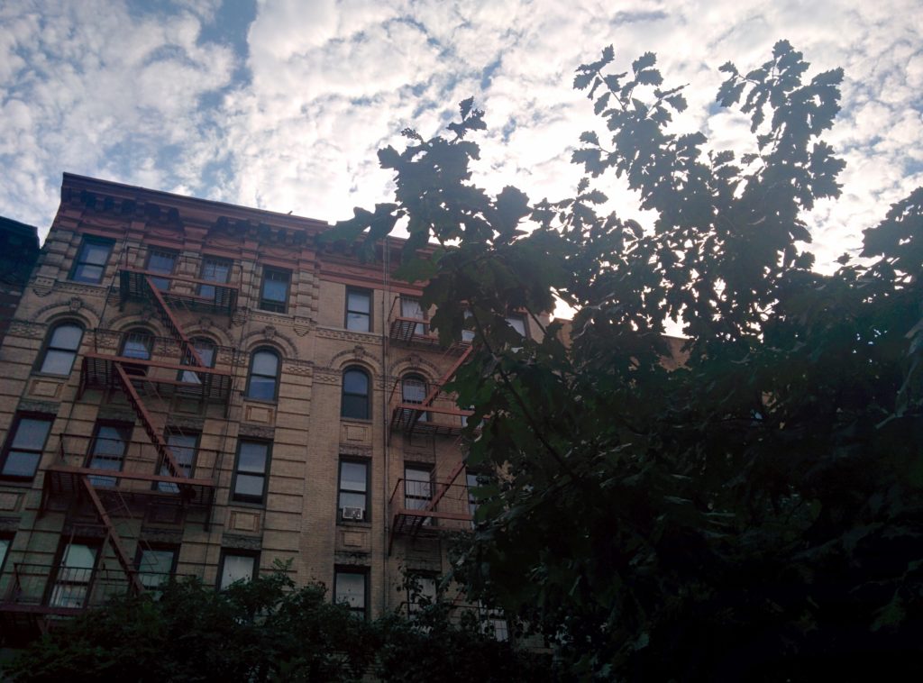
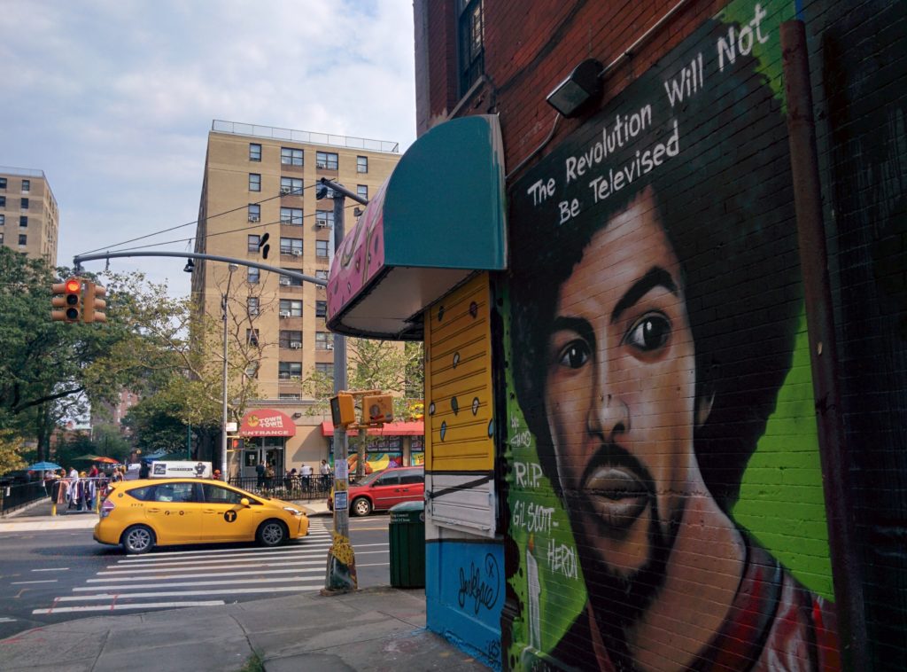
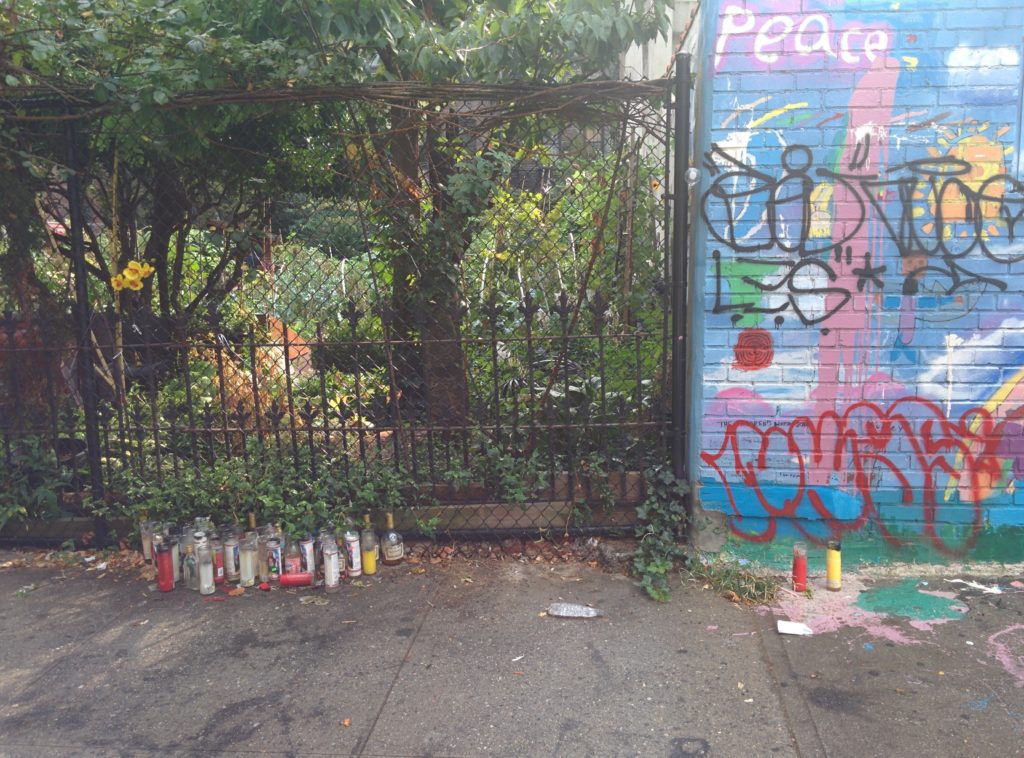
This will be my first blog post for ITP. I’m very excited to get started! Haven’t worked in WordPress for a while, so it will take some time to shake the dust off. But I’m looking forward to getting into a groove with blogging and being diligent about my documentation. Which means I’ll need to add photos, so lets test this out…
Captions? Yes please! Image should also be a link to the full res file.
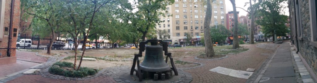
I’ve been lucky enough to see some of the city before starting school, as you can (should?) see above.
It has also been really inspiring looking at other ITP blogs. Can’t wait to see what my fellow classmates will have to share, as well. Thanks to all the faculty, staff, residents and second years for the assistance, words of wisdom, and demonstrations. And my regards to all of us first years: good luck and have fun.