For our first blog post assignment for Interaction Design Studio, we were asked to show two examples of interaction; one that is well designed and one that is poorly-designed.
I’m going to start off by saying that my comparison will be a bit unfair. As a companion reading for our homework, we were asked to look at usability.gov and their guidelines on interaction. I’ll talk more about that later, but for now what I wanted to point out that the interactions being described on usability.gov were all put in context of utilitarian thinking, with specific end goals in mind for specific actions, and what I’m sensing is an assumption of “fixed” use. For example, there may be a priority on giving a user enough information so that they won’t make a mistake, but this takes for granted “mistakes” at all.
With a musical instrument, perhaps not all points of interaction need to be explicitly labeled because “play” might be encouraged. There is no such thing as a wrong note, just pick up the thing and start banging away! If you get something wrong it is fine, just press another button or pluck another string. This would NOT be a suitable paradigm for devices that use lots of high voltage to carry out specific tasks.
With that in mind, I’m going to compare two different button grids. One is a musical interface, a physical device called the Monome. The other is the grid of buttons on my microwave, but this extends to more or less every single microwave panel I’ve used. A bit unfair, considering the utility of both is different, I’ll admit. But I still have opinions.
Good Interaction:
Monome

The Monome is a physical box with push buttons that have an LED inside each of the buttons. On its own, it does nothing. It is intended to be used as a controller for other software. But also, software can talk to the Monome. Button presses can be sent from the Monome to the computer, but software on the computer can tell the Monome to light up certain buttons at certain times.
Before the Monome was released, light up buttons on musical controllers usually corresponded to the buttons being pressed. You might hit a button while drumming with you fingers, and you knew it was hit when it lit up. Or it might be a toggle; where I wanted to turn on an effect to change a sound and the button I pressed lit up when the effect was active and was dark when it wasn’t active. These are fine interactions. And actually, the Monome does these interactions… but only if you want it to.
The user can load different programs on their computer to change the way that they interact with the Monome. There are programs that play notes depending on a “bouncing ball” set of rules:
monome 128 noodle from Graham Morrison on Vimeo.
Play notes according to Conway’s Game of Life set of rules:
life on five twelve from tehn on Vimeo.
Or light up the Monome without making any noise at all:
Monome Text Scroller in Max from nomubiku on Vimeo.
Because it has no fixed function, the Monome’s physical face is just a grid of uniform buttons without any text at all whatsoever. No use labeling buttons when the function of a button can change whenever you want it to. We were asked to watch Objectified as part of our homework:
Dieter Rams talks about taking things away, making things as simple as possible and adding nothing more. I think that the Monome might be the music controller that Dieter Rams would design.
Since it’s release, many have hailed the Monome precisely because of this. A minimalistic design that gets out of the way of the performer, instead of the endless amount of knobs, buttons, sliders, and switches… let alone computer screens that can go along with them. It set a trend in musical controllers, later to be mimicked by Novation, Livid Instruments, and Ableton. The decoupled button and light combination seems to resonate with people trying to interact with their computers in a novel way.
Moving from that grid of buttons, to another more common grid of buttons.
Bad Interaction:
Microwave panel
My microwave works the way it works, in a manner that is mostly similar but not quite exactly the same as the microwave I had before I moved and got a new one. Which works in a manner that is mostly similar but not quite exactly the same as the microwave that you use. Which works in a manner that is mostly similar but not quite exactly the same as the microwave that was the one you grew up with. And so on and so on.
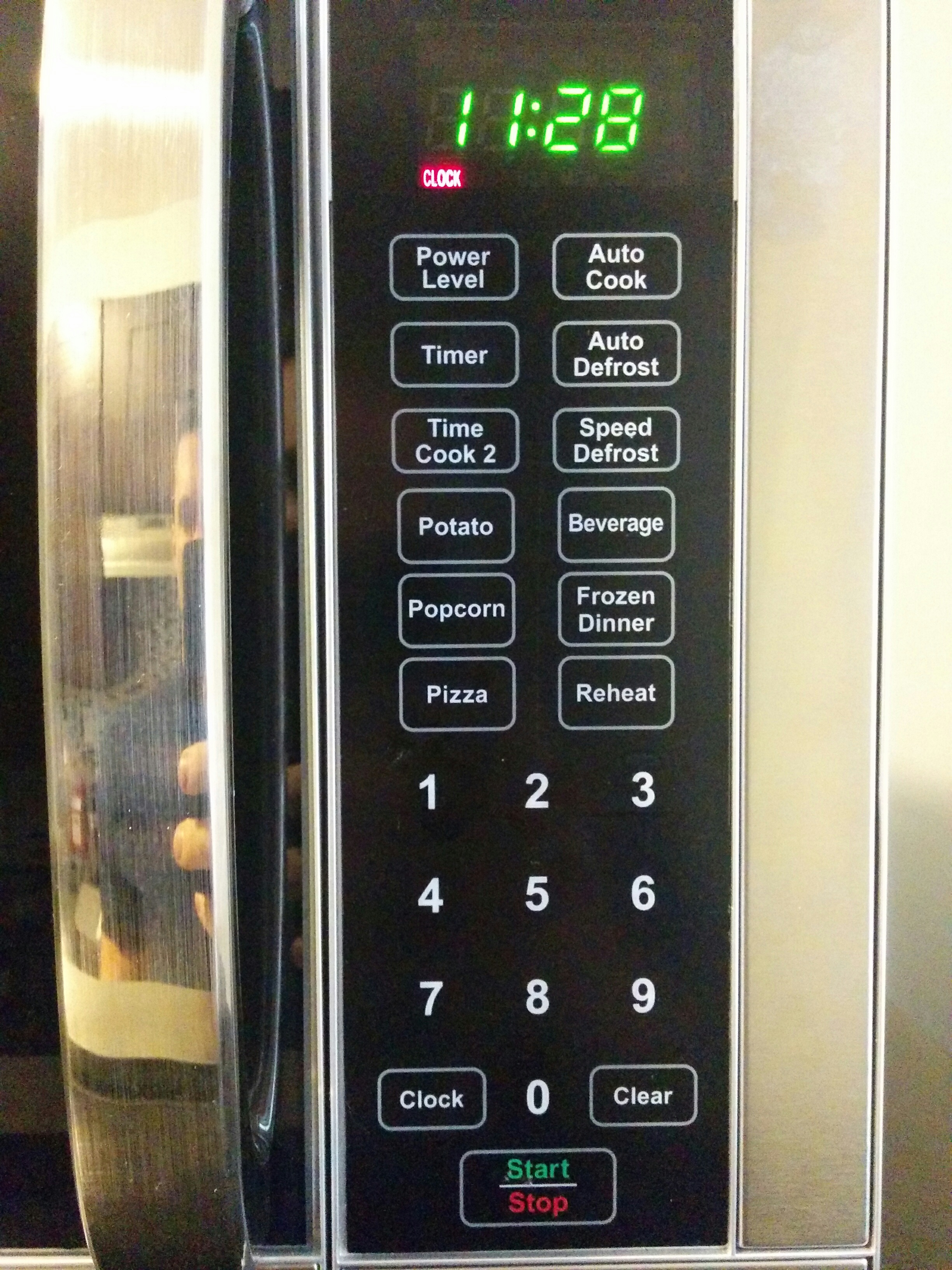
A microwave needs to heat up food for certain amounts of time. Hence, the most commonly used buttons are the number buttons. These let you enter an amount of time for the microwave to run. Then a start button, and a stop button. A physical button opens the microwave door.
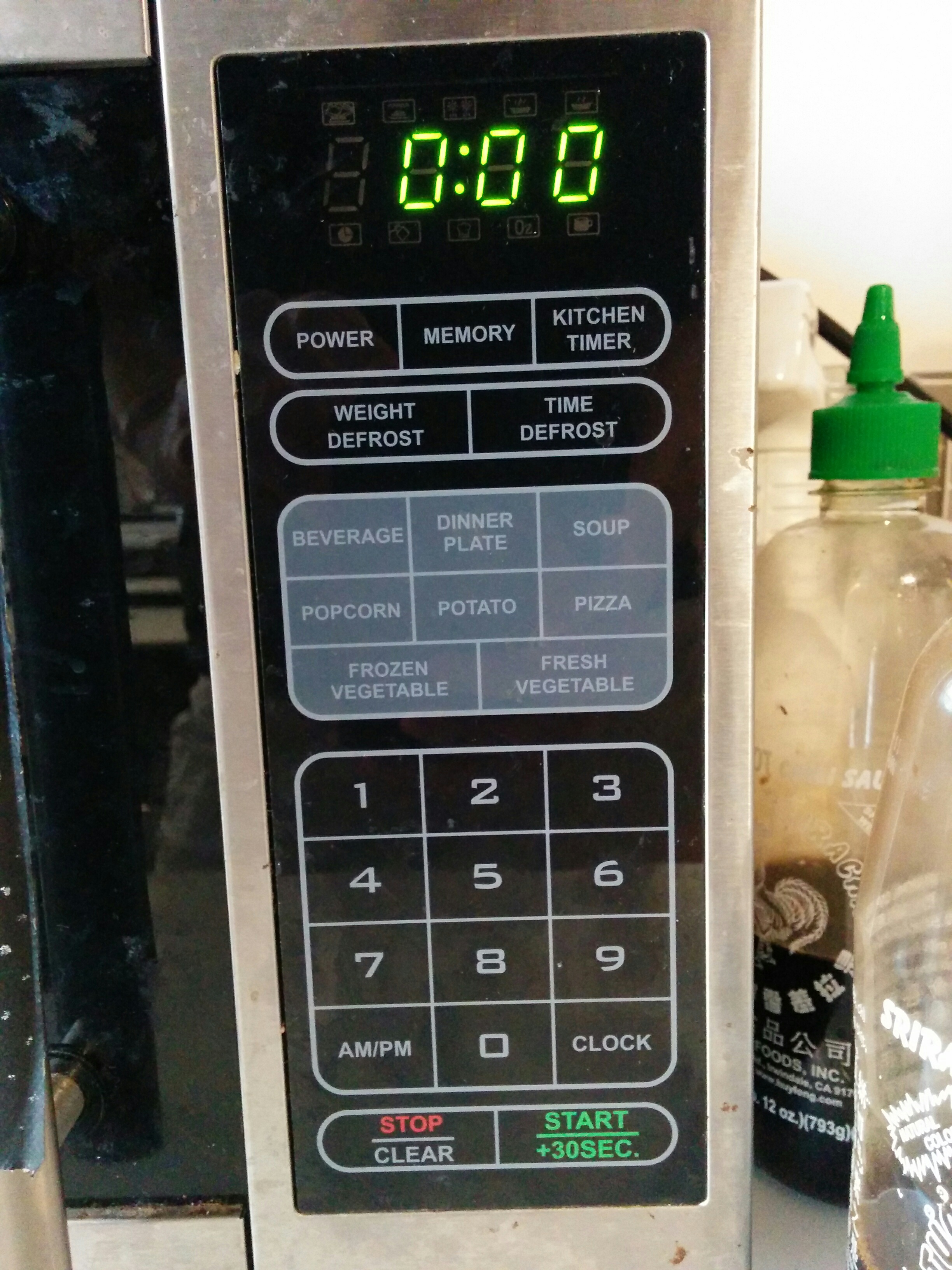
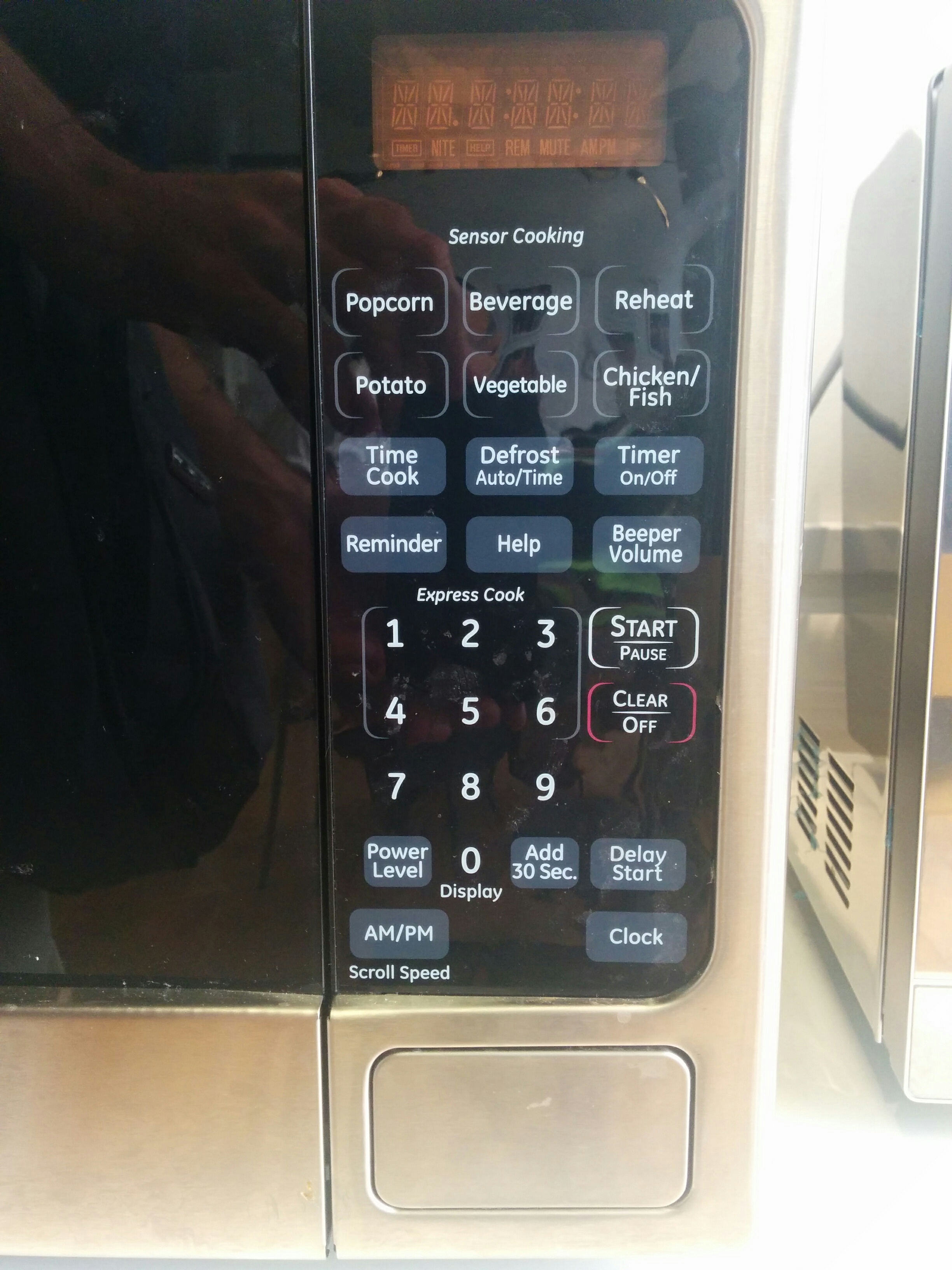
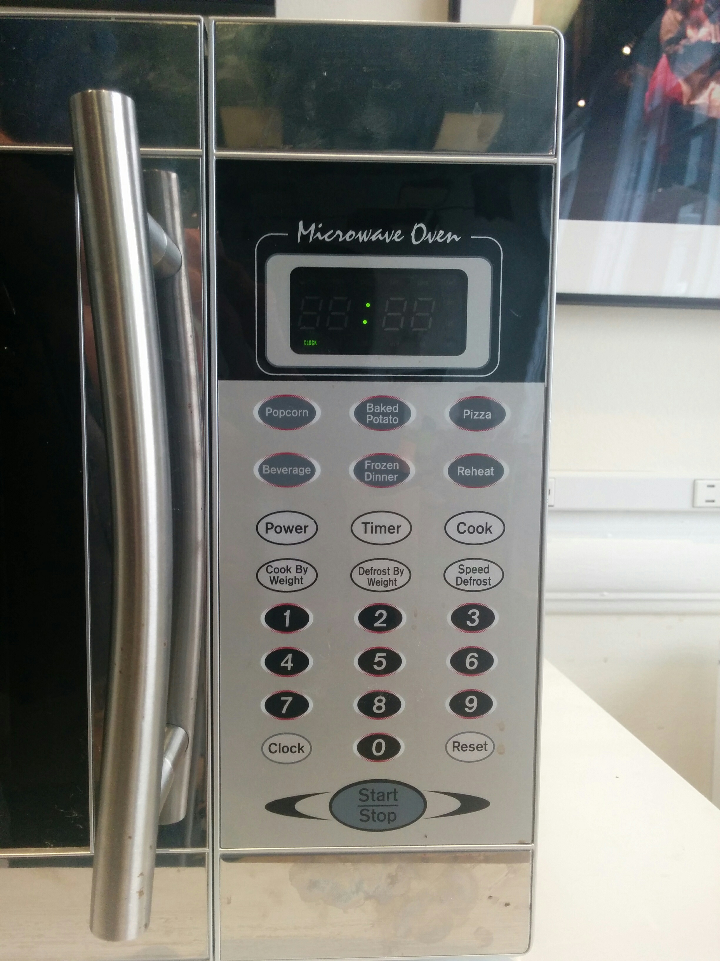
Then comes a menagerie of other buttons. Many, if not all, of these buttons are ever used. I’m not sure if any of these extra buttons are ever consistent across brands. My new microwave, your new microwave, my old microwave, your old microwave. They’re all a little bit different. The microwave in the ITP student lounge, for example:
Offering settings for specific foods is popular, but each panel has its own ideas about what you should be heating up. Sometimes we see “Baked Potato”, but here we see “Potato”, which apparently as far as this microwave is concerned is not a vegetable, which have their own frozen and fresh settings. “Dinner Plate” is insanely vague, and even if I’m using an educated assumption of using this setting for a scenario like reheating Thanksgiving dinner leftovers, how is this that much different than the “Pizza” setting? What if my pizza is on a plate? Is it one slice of pizza, or more?
Popcorn the closest thing to the microwave’s greatest hit, but I don’t think I’ve ever used a popcorn button on a microwave and been happy with the result. It is either too much or too little. I get the feeling that most people have the same experience. And in the smoke and ashes of one bag of burned popcorn too many, we are made cynical to the world. I don’t know anyone who expects any of these food-based pre-sets to work properly. So what do we do? We punch in a number, press go, and either put it back in when it comes out too cold or abruptly punch the eject button when we smell burning or see our soup bubble over its container like lava rolling through Pompeii.
I don’t trust you, microwave. I’ve been hurt before. And this is where we can look again at usability.gov’s guidance: Are you following standards? In short, I’ll say no. But really I’m not sure if there are any standards on microwave interfaces. No standards. Bad usability.
So, if we refuse to admit defeat to the microwave, and want to become microwave users of discriminating taste, we might play with the power setting. Because really, that is all any food preset is doing: calling up a preset amount of time to run the microwave at a preset level of intensity. Thankfully, microwaves let us adjust the power manually. How do I do that again?
Again, NO STANDARDS. At this point, most people are willing to settle on letting the machine run at its default power and adjust the cooking time. This makes at least half of the other buttons on a standard microwave functionally useless. But we are determined connoisseurs of microwaveable delights and we demand precision. And my Amy’s frozen enchilada is very insistent that I use only half power for 5 minutes before ramping up to full power for a final minute and a half. So for our sake and Amy’s, let’s figure this out. Back to my microwave:
Beeping. Good god make the beeping stop.
“Do error messages provide a way for the user to correct the problem or explain why the error occurred? Helpful error messages provide solutions and context.”
Oh, usability.gov, what a sweet naive world you must live in. How about we start over and ask, “Do error messages distinguish themselves from any other message?” In the language of the microwave, the answer is no. Have you pushed a button? Beep. Have you entered a new mode? Beep. Have you made an error? Beep. Have you not made an error? Beep. I have no idea why there aren’t different kinds of beep tones on microwaves.
The correct way to change the power (on this microwave) is to enter the time first, and then press the power button in order to adjust the scale from 0 to 100, and then press start. However, if you may think that you set the power first and then enter the time, you get beeping. But there is no visual feedback that anything has happened. Because this beeping seems the same as the “congratulations, you just pressed 3” beeping, and the “let’s heat up this enchilada!” beeping, you can’t be sure if what you did is right or wrong. So, with the microwave’s blank stare waiting for further action, you might be tempted to press a button in order to adjust the power. That number will come up, but you are entering the cooking time and not the power. I managed to figure it out eventually after some trial and error. “Maybe hold the power button then press a number button?” “Beep.”
Ultimately, I noticed that two beeps meant error, and one meant success. I’m not sure if there is any inherent logic in this, and it took me at least a dozen beeps to notice that was the case.
I could go on, but for the sake of brevity I’ll leave it at that. Again, I’m being a bit harsh on the microwave. I’m not going to be freestyling my next ambient masterpiece on the Sayno in the ITP lounge (it only makes one beep tone anyways…), and I may just be cranky from hunger while waiting for my enchilada to cook, so I’m willing to give these things a bit of slack. But in comparison to the Monome, even though the microwave grid of buttons has explicit labeling, use and functionality isn’t very intuitive. At least with the Monome, you can look at it and instantly know that you don’t know the function of the buttons yet. This can prompt play and natural discovery. With the microwave, you are getting instructions but they aren’t good ones. It is the difference between being able to freely explore in a big happy field, and taking a trail where the signs don’t always say where they are actually pointing to.
This reflection has been very interesting to me. Even the humble button, with what might be the simplest of interaction language (“Bang this thing, and this other thing happens”), can still have wildly different approaches and needs depending on activity and user.