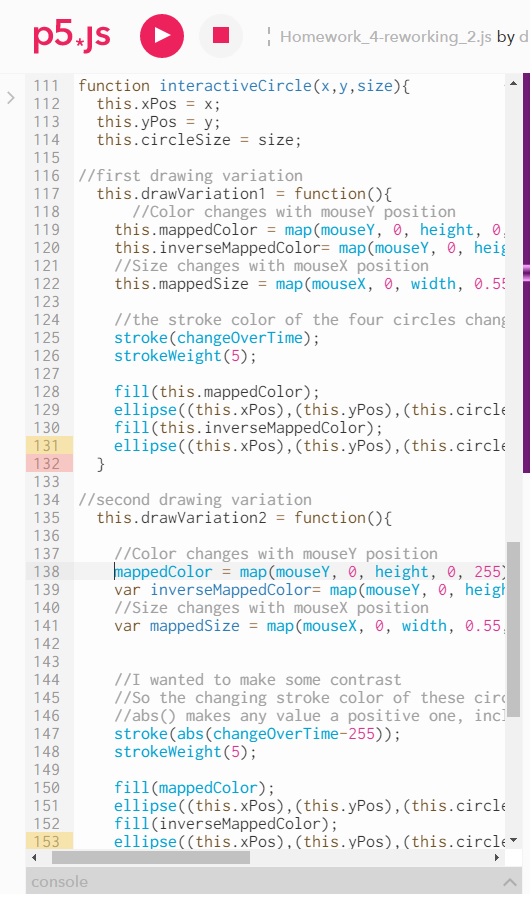
For our fourth homework assignment, we were asked to re-work an old homework assignment by adding functions, objects, a function that returns the results of a mathematical operation, and using objects. I decided to also implement the ‘bonus’ goal of using a function inside of an object.
It was really soothing to go back and re-organize everything in this sketch, almost like a spring cleaning. Adding a function for the lines in the middle allowed me to play around with the amount, and making the circles into objects allowed me to tweak all their behavior as I needed without the endless copying and pasting. And revisiting everything allowed me to create an oscillating fading effect instead of having abrupt jumping.
I decided I wanted to work with adding functions into an object, since I haven’t had much in-depth experience with Javascript specifically and was curious about how this was going to work.
Speaking of this…
So many this-es! Theeses? Thisii? I had to use ‘this’ a lot. This felt strange to me coming from other programming languages. From example code in the book, it seems like these are necessary, and perhaps functions as a kind of in-object specific local variable. Still, it seemed odd to have to specify “this” all the time. Feels redundant. Then I was realized I was using it when I might not necessarily have had to. I don’t want to jump ahead in class, but would like to talk about the best ways to use ‘this’, and maybe some ways that we can avoid having to type it out so much.
Looking forward to moving onward into Javascripting, and the synthesis class on Friday to start taking these skills into the Arduino realm (and visa versa).
This week’s class discussion and accompanying lab revolved around analog output from the Arduino. My only experience with this to before was with fading LEDs, so I was excited to start moving motors and making noise!
I decided I wanted to build off of my last lab (…didn’t have the heart to pull out all those LEDs just yet…), and add new features to what I already had. When looking for inspiration around the web for using motors with and Arduino, I noticed that some breadboard diagrams used a diode for protection but our material did not. It seems like the transistor in our kit has a diode built in. Might be a question for class: is this the exception or the rule when buying transistors? In any case, having one built in saved me some space on my already cramped circuit board.
The knob pot interacts with the light in the same way as the previous lab. When there is no light, we are all the way down and when the green LED is lit we are at full value. Let’s take this motor for a spin!
I know it is a simple thing to do, but it really is a cool feeling making things move. As you can kind of see from the light (placed my hand there on purpose as to not blind the camera), and hear from the motor, the motor is moving.
An idea was forming, so I quickly moved onto adding some noise. Using the tone() function examples along with the pitches.h header file was very straightforward.
What is that white blob in the video? It is a substance called prototype plastic that I picked up a few years back at a local Makerfaire. Initially it comes as little plastic beads, and if you let it soak in extremely hot water for a few minutes it becomes malleable. You can mold it into whatever you want, and when it cools, it hardens again. It is useful stuff! Pretty strong, but also reusable. I had an idea I wanted to try:
I have a little hand cranked music box that uses music sheets that you can author yourself by using a special punch hole tool. What I wanted to do was link the mechanical action of the DC motor to the crank of the music box. So I molded this “adapter” that held both shafts tightly together. Long story short, I couldn’t get it to work. I could make the motor spin with the plastic on it, but at the end of the day I just don’t think the motor was strong enough to make the music box crank spin. Certainly opened my eyes to the potential complexities of mechanical action. Turning the music box with your hand is a smooth and reliable interaction, and I just assumed this little motor was up to the task. Apparently not so. Definitely would like to talk in class about the process of picking motors, and building or choosing more… professional “middleware” to put between a motor and an object (as opposed to my freaky plastic blob).
So with that little experiment aside, I decided to implement the other half of my concept. Make the digital noise increase in speed with the potentiometer. I love making crazy noises, so I had a bit of fun with extremely speeding up the example sequence:
I have some ideas on how to make this a performative musical device as I grow my physical computing skills. Stay tuned. In the meantime, I’ll be trying to get “shave and a haircut” out of my head after listening to it over and over again. Thanks, Arduino example code.
For our assignment, we were given a few terms collected from the book Universal Principles of Design. I was given the following phrases to explain and analyze:
Fibonacci Sequence
Golden Ratio
Most Average Facial Appearance Effect
Normal Distribution
Most people are familiar with Normal Distribution as the “bell curve” when plotting values across across of a distribution. In the book, this example shows average height among men and women. We might have come across the terms in standardized testing or being graded in a class. It is a statistical approach of measuring variance from the average. In a normal population, approximately 68 percent of the population falls within one standard deviation of the average, a plus or minus of 34.13% away from 50%. These percent values, or percentiles, help judge the distance from the “normal” or “average” value. If 50% is average height for a man, then someone who is 99% is much taller than average, and 1% much shorter.
The Most Average Facial Appearance Effect (or MAFA Effect, here I will call MAFAE) builds off of this understanding of calculating what is average. The MAFAE asserts that, “people find faces that approximate their population average more attractive than faces that deviate from their population average.” In relation to MAFAE, “population refers to the group in which a person lives or was raised,” and “average refers to the arithmetic mean of the form, size and position of the facial features.” When we think of a perfectly Normal Distribution, when all values are averaged you wind up in the middle with whatever value is at the 50th percentile. In a similar approach, a visual description of the MAFAE blends all faces together to depict the most “average” face, which is also described as most attractive.
With this kind of visual averaging, the resulting faces are usually more symmetrical, which has found to be a valued when judging attractiveness. Further, the MAFAE is used to explain why people may find members of the same race attractive. This is justified by what is speculated to be a genetic, evolutionary preference, and perhaps some innate fear or distaste for the unfamiliar. According to MAFAE, unfamiliar groups can eventually become familiar, and henceforth the “cognitive prototypes are updated and the definition of facial beauty changes.”
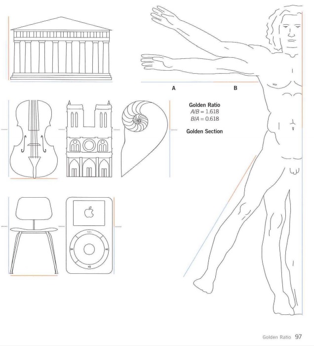
This preference for the natural extends to our next two terms, Golden Ratio and Fibonacci Sequence. The Golden Ratio is defined as the ratio between two segments such that the smaller segment is to the larger segment as the larger segment is to the sum of the two segments. This is larger segment is 0.618 compared to the sum of both equalling one. This is a little dense to type out and read, but can be understood much easier visually.
These are Lidwell’s examples from Universal Principles of Design
Luckily, there are many depictions of this ratio being examined in relation to many beautiful man made and natural objects. Lidwell cites that, “the golden ratio is found throughout nature, art, and architecture.” Along with Mondrian and da Vinci paintings, pine cones, seashells, and the human body are used as examples of things that possess this Golden Ratio. In fact, it is the cover of the book itself.
These things are said to be subconsciously preferred, appreciated and found beautiful. Eventually, using this ratio became a conscious strategy, and part of a template for all kinds of works and designs. Lidwell suggests exploring golden ratios in design, “when other aspects of the design are not compromised”.
A similar phenomenon of intrinsic aesthetically value is the Fibonacci Sequence. A Fibonacci Sequence is a sequence of numbers in which each number is the sum of the two preceding numbers. An example being 1,1,2,3,5,8,13. Lidwell cites the “seminal work” on the Fibonacci Sequence, “Liber Abaci” from 1202. Saying, “ubiquity of the sequence in nature has led many to conclude that patterns based on the Fibonacci sequence are intrinsically aesthetic and, therefore, worthy of consideration in design”. Much like the Golden Ratio, the Fibonacci Sequence can be found in nature: the number of flower petals and bones in the human hand. Also similarly, after identifying this pattern, artists and designers started consciously using it in their work. The Golden Ratio and the Fibonacci Sequence are closely linked: the division of any two adjacent numbers in a Fibonacci Sequences yields an approximation of the golden ratio. Earlier on, it is less accurate, but as the sequence increases it becomes more so.
Themes, and my take
The grouping of these terms points to ideas about what is considered average, normal, natural, intrinsic, and perhaps some kind of concept of ‘perfection’. We want to be able to measure these things, thinking of Normal Distributions, which can be implemented in grading or formulation of public policy. We want to be able to model these things, thinking of a perfectly beautiful face. And we want to believe in a kind of mystical property for these things that we want. The subjectivity of beauty meets the objectivity of math with the Golden Ratio and the Fibonacci Sequence. Humans simply just prefer these things, and even though we don’t know why, there is a kind of mathematical code that points the way to replicating it.
To Lidwell’s credit, he qualifies and hedges all of these terms. He notes Normal Distribution is a statistical model by which to analyze measurements, not an inherent truth. This is in addition to reminding us that with design, we should actually pay more attention to the outliers, the 1% and 99% populations, in order to closer make a design that is effective for 100% of the population. This sentiment was echoed in the Objectified documentary with the designers trying to create gardening shears.
The Most Average Facial Appearance Effect is peppered with qualifiers, “the effect is likely the result…”, “…it is possible a preference for averageness…”, “If this is the case..” and so on. And the Fibonacci Sequence and Golden Ratio have outright warnings. Lidwell cites that while there have been some studies that purport to show that people aesthetically prefer things that have these traits, these studies have also been challenged. But it seems that hasn’t prevented them from being adopted and spread among our zeitgeist.
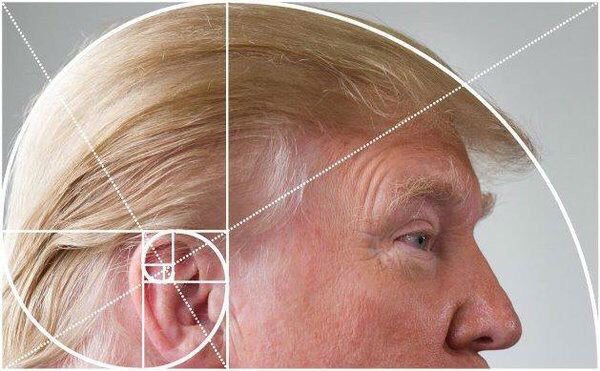
In fact, in researching these things, I discovered a kind of online subculture of people complaining about the Golden Ratio and Fibonacci Sequences in popular culture.
Part of this seems to be in reaction to a hyping up of both theories. “Fibonacci Numbers are found in nature,” seems to have been rounded up to, “THE NUMBER OF PETALS ON A FLOWER ARE ALWAYS FIBONACCI NUMBERS OMG!!!!” (when this is demonstrably not the case at all). This can be attributed to a misunderstanding of the theories and maybe some opportunistic hucksters looking to sell books and get advertising clicks, but the instinct to even amp up these concepts in the first place is very telling to me.
My take is that all of the terms I was given can be good general guides when looking for inspiration, searching for possible themes, and coming up with rudimentary methods of analysis. But there is a danger of feeling that they are inherent. And that danger is likely, because if pop culture around these concepts is any guide, we crave this objectivity and rock solid “normality”.
Using any statistical method of analysis, like Normal Distribution, can be dangerous if you aren’t paying attention to how you are collecting your data. Which can mess up your Most Average Facial Appearance Effect model of the “most attractive person,”: how many people did you analyze? From what places? Are they considered “familiar” or “unfamiliar” to your target audience? How would you know? And then if you have drawn your conclusions from less than ideal data, methodologies, and theories, this can keep you only focused on things that fit your conclusion. You only notice flowers that have Fibonacci petals, and don’t pay attention to the ones that don’t. Then after a long enough time, you wind up taking these theories for inherent facts. That is until you notice something that makes you question the whole thing…
Final verdict: Don’t throw the baby out with the bath water. But keep these concepts in context. Despite popular depictions, try to use these as design tools, not rules.

