IDS Final: ACM Digital Library reseach

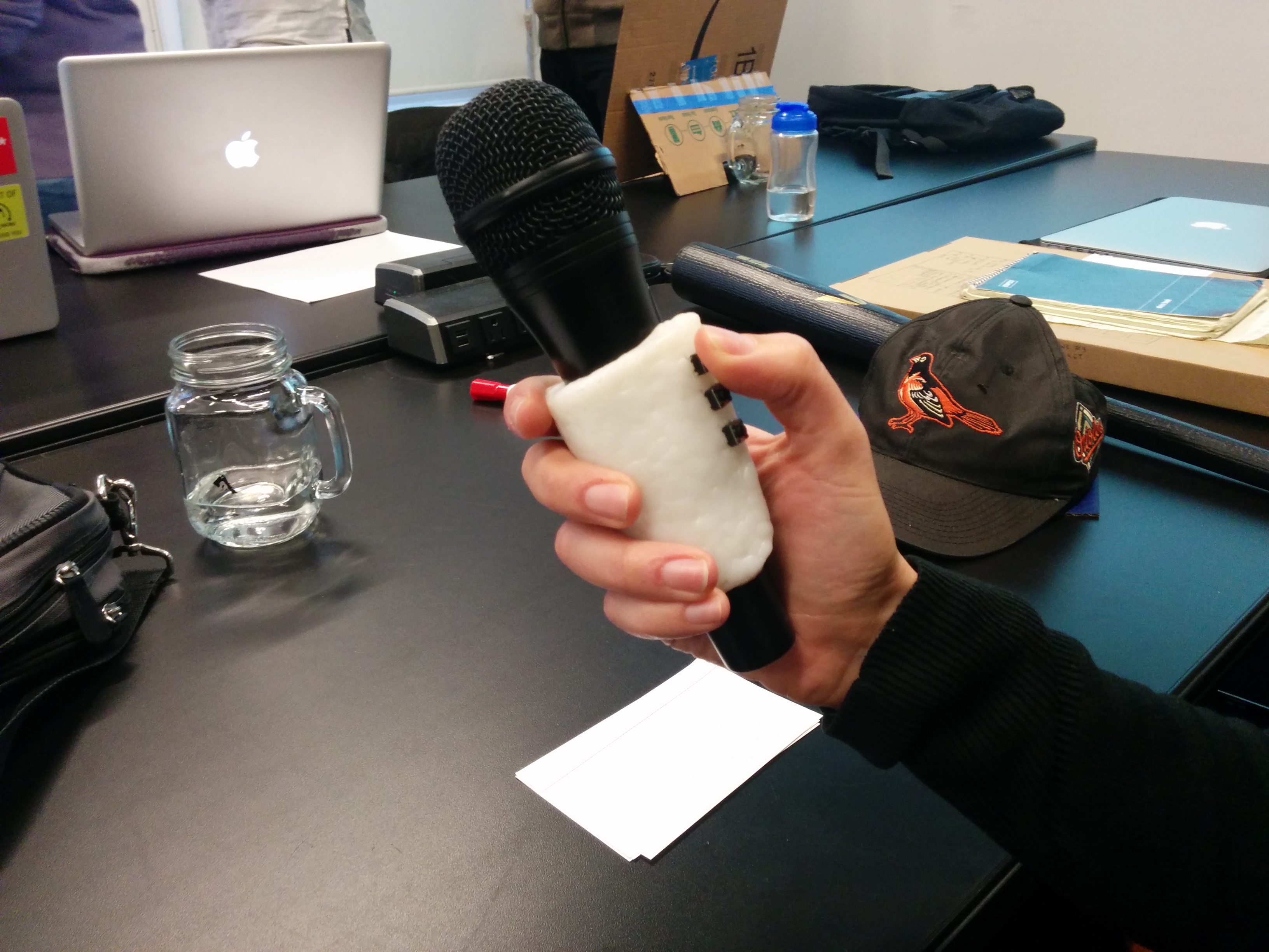
For the IDS final, I’m going to be combining with my Physical Computation final to build an interface for my Mic Cuff Controller. When searching around the ACM Digital Library site for articles, I found some interesting similar takes on what I’m trying to physically build.

The E-Mic seems to be in a similar realm. Incidentally, one of the prototype proposals on page 5 is the closest thing I’ve found to what I’ve been physically trying to implement (fig 22):

http://dl.acm.org/citation.cfm?id=1085743

And off the site, a prototype called “Project Tahoe”:

http://vhosts.eecs.umich.edu/nime2012/Proceedings/papers/202_Final_Manuscript.pdf

Though, I believe one of the more valuable discoveries in my ACM DL searches was discovered when I started broadening my search terms. I’m starting to commit more to the physical shape of my device, and I know that at least for now I want to stay somewhat focused on musical applications for it. I want an engaging, fun user testing scenario and I think musical activity will bring that about.

However, because I want to focus on a more casual user for the time being, I need to be careful about the software that is being used to demonstrate what the Mic Cuff Controller can do. With a certain amount of functional prototyping done, I am starting to focus on making user friendly software that allows for customization.

Being able to let users who may not be musically inclined play with a musical device offers certain design challenges. We want the users to be able to make changes to the state of playback, and be able to clearly implement decisions. However, an overly technical UI could be overwhelming, and may cause users to disengage. Though in trying to course correct for that, you could wind up taking away too many options and wind up with functionality that is too limited. This could also lead to users disengaging if they can’t do much with the program. My IDS final will be focusing on how to strike this balance.

I found a really interesting paper related to these ideas:

User Customization of a Word Processor

http://dl.acm.org/citation.cfm?id=238541&CFID=870155206&CFTOKEN=24252391

This is a 1996 paper from Stanley R. Page, Todd J. Johnsgard, Uhl Albert, and C. Dennis Allen about “identifying the customization changes users typically make to their word processors.” The main takeaways are that many people customize their software when given the chance, and that the researchers didn’t expect these findings. “A surprising 92% of the participants in this study did some form of customization of the software.” Additionally, the only predictive indicator of a person to customize was how often they used the program. Five categories of customization activities were identified: 1) customizing functionality, 2) customizing access to interface tools, 3) customizing access to functionality, 4) customizing visual appearance, and 5) setting general preferences. (“Findings”, p342-343)

I could go on with everything that has inspired me about this paper, but then I would just wind up re-typing the entire paper all out on this blog. Even though this research was done 20 years ago, I think this paper is a great reminder of fundamental UI principles and customization best practices. I’ve been meditating on this research and thinking of the best ways to heed it’s advice or push the ideas forward. One lead I’ve been pursuing pertains to the last paragraph:

“Finally, studying the patterns of users’ customization should help us move our adaptable systems to self adapting ones; systems that will accurately anticipate the customers’ work and respond by providing the appropriate tools and services. To this end we need to continue to study when, why, and how users tailor software to accomplish their work.” (p345)

A concept to integrate the desire for more study would be to integrate the study into the interface itself. A program that could analyze its own usage could be able to change its interface based off of that data. Or, more precisely, prompt the user with an opportunity to change the interface themselves. A simple example would be to track the amount of times the user has opened the program. If after, say, 50 times using the program, the user has still not entered an “options” menu to customize the program, then upon the 51st time opening the program prompts the user with information about the options menu and what it can do for them.

These ideas became a little more tangential from what I was originally trying to achieve with my project, but I am going to see if I can integrate them into the work. The danger would be basically re-creating Microsoft’s much hated “Clippy” word processing assistant feature. But I think there can be something between that and a complete lack of communicated information about a given interface. Given the prevalence of customization among all users, and the knowledge that more frequent users are more likely to customize, I think that some form of this approach could be interesting to try.

Even though if that particular experiment is more appropriate for another project, the paper has been a great source of research. It is good to know that users *will* customize, why they customize, and how they customize.

IDS: Final Project Prep

We’ve started coming in on the last half for IDS, and have been asked to start developing our ideas for final projects. While we have been studying Max MSP as our interface, we are not required to use it. However, I’ve been having a great time with it so far and I think it could be of great use for my particular interface.

img_20161109_132056

For Intro to Physical Computation, I’ve been developing an idea for a physical prototype. It is a cuff that fits around any standard sized microphone that would also have input buttons on it. These buttons would be used as user input, so that a performer would not only be able to communicate with the microphone but also interact with software while performing.

I’ve had a decent amount of discussion with Benedetta and my classmates about more specifically identifying an end user, and hence activity. My claims of, “Anyone using a hand held microphone with a computer!” didn’t seem to make the cut. As I had originally conceived of this as a musical performance device before expanding my horizons, I decided it was best to bring back the concept to it’s original roots and stick with that for now.

However, for IDS, I would still like to explore the idea of giving users greater control over how their software and hardware works. Trying to balance customization, ease of use, and meaningful options for interaction seems like a healthy but worthwhile challenge.

For Physical Computing, I will try to focus on one use case for that project. But for IDS, I would like to iterate on the functionality and create multiple use cases for my physical prototype. In order to avoid casting too wide of a net, I will start by focusing on musical applications. The end goal would be to create multiple modes of interaction that are easily changed from mode to mode, customizable, and have all of this interaction clearly understood and easily used by a non-technical end user.

I will need to clear my idea with both professors in order to properly section this project into pieces that satisfy the requirements for both classes. It would also be good to clarify with Luke the specifics for IDS: How many different modes would be appropriate for this objective? How far down the “non-technical end user” rabbit hole should I go? Which existing software interfaces should I be aware of when trying to implement this idea?

Looking forward to seeing this idea come to fruition.

IDS: Starting Prototypes with Max MSP

After a week off from class, we’ve returned with some prototypes. Luke started showing the class ways to get started with Max MSP, using webcam control of audio for  a first example. Then he emailed us the guts of a synthesizer, the Vom-o-Tron! It is a formant synthesizer for creating human-like vowel sounds. It sounds a little creepy, like a robot vomiting, but was fun for making crazy noises. Our task was to make an interface for it.

vomotron_interface

It is still a work in progress, but in general I had some fun using it. Since Vom-O-Tron is a whacky name, I decided to go with a fantastical, cartoonish skeuomorphism. The synth’s name vomit’s its content onto the screen in a multicolored rainbow mess. I’ll let you play with it. Download link here:

prototype-vom-o-tron

Just to note, the sequencer is a bit… broken. And just in time to perform it in front of class for everyone! Projects always behave best at home, right? Notes for getting it kick started again can be found in the comments next to the sequencer while in edit mode.


I still wanted to use some of the webcam work we had done in class. Matt Romein held some Max workshops at ITP, so I rolled in some of the things I learned there. This musical interface records from your microphone when you press the space bar. Then the web cam watches for the color red and blue. The sampled recording will playback at higher speeds when it sees red on the screen, lower speeds when it sees blue. The screen is split into a 3×3 grid, so moving colors around will playback at different rates as well.

musicalinterface_screenshot1

I made some printouts to play with the functionality. I’ll include them in the download zip as well:

musical-interface-prototype-1

IDS Blog 2: Universal Principles of Design

For our assignment, we were given a few terms collected from the book Universal Principles of Design. I was given the following phrases to explain and analyze:

  • Fibonacci Sequence
  • Golden Ratio
  • Most Average Facial Appearance Effect
  • Normal Distribution

Most people are familiar with Normal Distribution as the “bell curve” when plotting values across across of a distribution. In the book, this example shows average height among men and women. We might have come across the terms in standardized testing or being graded in a class. It is a statistical approach of measuring variance from the average. In a normal population, approximately 68 percent of the population falls within one standard deviation of the average, a plus or minus of 34.13% away from 50%. These percent values, or percentiles, help judge the distance from the “normal” or “average” value. If 50% is average height for a man, then someone who is 99% is much taller than average, and 1% much shorter.


The Most Average Facial Appearance Effect (or MAFA Effect, here I will call MAFAE) builds off of this understanding of calculating what is average. The MAFAE asserts that, “people find faces that approximate their population average more attractive than faces that deviate from their population average.” In relation to MAFAE, “population refers to the group in which a person lives or was raised,” and “average refers to the arithmetic mean of the form, size and position of the facial features.” When we think of a perfectly Normal Distribution, when all values are averaged you wind up in the middle with whatever value is at the 50th percentile. In a similar approach, a visual description of the MAFAE blends all faces together to depict the most “average” face, which is also described as most attractive.

With this kind of visual averaging, the resulting faces are usually more symmetrical, which has found to be a valued when judging attractiveness. Further, the MAFAE is used to explain why people may find members of the same race attractive. This is justified by what is speculated to be a genetic, evolutionary preference, and perhaps some innate fear or distaste for the unfamiliar. According to MAFAE, unfamiliar groups can eventually become familiar, and henceforth the “cognitive prototypes are updated and the definition of facial beauty changes.”


This preference for the natural extends to our next two terms, Golden Ratio and Fibonacci Sequence. The Golden Ratio is defined as the ratio between two segments such that the smaller segment is to the larger segment as the larger segment is to the sum of the two segments. This is larger segment is 0.618 compared to the sum of both equalling one. This is a little dense to type out and read, but can be understood much easier visually.

https://en.wikipedia.org/wiki/Golden_ratio#/media/File:Golden_ratio_line.svg


lidwell_gr_examples
These are Lidwell’s examples from Universal Principles of Design

Luckily, there are many depictions of this ratio being examined in relation to many beautiful man made and natural objects. Lidwell cites that, “the golden ratio is found throughout nature, art, and architecture.” Along with Mondrian and da Vinci paintings, pine cones, seashells, and the human body are used as examples of things that possess this Golden Ratio. In fact, it is the cover of the book itself.

upod_cover
These things are said to be subconsciously preferred, appreciated and found beautiful. Eventually, using this ratio became a conscious strategy, and part of a template for all kinds of works and designs. Lidwell suggests exploring golden ratios in design, “when other aspects of the design are not compromised”.


A similar phenomenon of intrinsic aesthetically value is the Fibonacci Sequence. A Fibonacci Sequence is a sequence of numbers in which each number is the sum of the two preceding numbers. An example being 1,1,2,3,5,8,13. Lidwell cites the “seminal work” on the Fibonacci Sequence, “Liber Abaci” from 1202. Saying, “ubiquity of the sequence in nature has led many to conclude that patterns based on the Fibonacci sequence are intrinsically aesthetic and, therefore, worthy of consideration in design”. Much like the Golden Ratio, the Fibonacci Sequence can be found in nature: the number of flower petals and bones in the human hand. Also similarly, after identifying this pattern, artists and designers started consciously using it in their work. The Golden Ratio and the Fibonacci Sequence are closely linked: the division of any two adjacent numbers in a Fibonacci Sequences yields an approximation of the golden ratio. Earlier on, it is less accurate, but as the sequence increases it becomes more so.

Themes, and my take

The grouping of these terms points to ideas about what is considered average, normal, natural, intrinsic, and perhaps some kind of concept of ‘perfection’. We want to be able to measure these things, thinking of Normal Distributions, which can be implemented in grading or formulation of public policy. We want to be able to model these things, thinking of a perfectly beautiful face. And we want to believe in a kind of mystical property for these things that we want. The subjectivity of beauty meets the objectivity of math with the Golden Ratio and the Fibonacci Sequence. Humans simply just prefer these things, and even though we don’t know why, there is a kind of mathematical code that points the way to replicating it.


To Lidwell’s credit, he qualifies and hedges all of these terms. He notes Normal Distribution is a statistical model by which to analyze measurements, not an inherent truth. This is in addition to reminding us that with design, we should actually pay more attention to the outliers, the 1% and 99% populations, in order to closer make a design that is effective for 100% of the population. This sentiment was echoed in the Objectified documentary with the designers trying to create gardening shears.

The Most Average Facial Appearance Effect is peppered with qualifiers, “the effect is likely the result…”, “…it is possible a preference for averageness…”, “If this is the case..” and so on. And the Fibonacci Sequence and Golden Ratio have outright warnings. Lidwell cites that while there have been some studies that purport to show that people aesthetically prefer things that have these traits, these studies have also been challenged. But it seems that hasn’t prevented them from being adopted and spread among our zeitgeist.


In fact, in researching these things, I discovered a kind of online subculture of people complaining about the Golden Ratio and Fibonacci Sequences in popular culture.

Words:

https://www.fastcodesign.com/3044877/the-golden-ratio-designs-biggest-myth

https://www.lhup.edu/~dsimanek/pseudo/fibonacc.htm

Images:

https://xkcd.com/spiral/

http://www.smash.com/celebrity-faces-become-hilarious-distortions-made-fit-fibonaccis-golden-ratio/


Part of this seems to be in reaction to a hyping up of both theories. “Fibonacci Numbers are found in nature,” seems to have been rounded up to, “THE NUMBER OF PETALS ON A FLOWER ARE ALWAYS FIBONACCI NUMBERS OMG!!!!” (when this is demonstrably not the case at all). This can be attributed to a misunderstanding of the theories and maybe some opportunistic hucksters looking to sell books and get advertising clicks, but the instinct to even amp up these concepts in the first place is very telling to me.


My take is that all of the terms I was given can be good general guides when looking for inspiration, searching for possible themes, and coming up with rudimentary methods of analysis. But there is a danger of feeling that they are inherent. And that danger is likely, because if pop culture around these concepts is any guide, we crave this objectivity and rock solid “normality”.

Using any statistical method of analysis, like Normal Distribution, can be dangerous if you aren’t paying attention to how you are collecting your data. Which can mess up your Most Average Facial Appearance Effect model of the “most attractive person,”: how many people did you analyze? From what places? Are they considered “familiar” or “unfamiliar” to your target audience? How would you know? And then if you have drawn your conclusions from less than ideal data, methodologies, and theories, this can keep you only focused on things that fit your conclusion. You only notice flowers that have Fibonacci petals, and don’t pay attention to the ones that don’t. Then after a long enough time, you wind up taking these theories for inherent facts. That is until you notice something that makes you question the whole thing…

http://lolworthy.com/wp-content/uploads/2015/12/trump-golden-ratio-fibonacci.jpg

Final verdict: Don’t throw the baby out with the bath water. But keep these concepts in context. Despite popular depictions, try to use these as design tools, not rules.

IDS Blog 1: Good Interface Bad Interface

For our first blog post assignment for Interaction Design Studio, we were asked to show two examples of interaction; one that is well designed and one that is poorly-designed.


I’m going to start off by saying that my comparison will be a bit unfair. As a companion reading for our homework, we were asked to look at usability.gov and their guidelines on interaction. I’ll talk more about that later, but for now what I wanted to point out that the interactions being described on usability.gov were all put in context of utilitarian thinking, with specific end goals in mind for specific actions, and what I’m sensing is an assumption of “fixed” use. For example, there may be a priority on giving a user enough information so that they won’t make a mistake, but this takes for granted “mistakes” at all.

With a musical instrument, perhaps not all points of interaction need to be explicitly labeled because “play” might be encouraged. There is no such thing as a wrong note, just pick up the thing and start banging away! If you get something wrong it is fine, just press another button or pluck another string. This would NOT be a suitable paradigm for devices that use lots of high voltage to carry out specific tasks.

With that in mind, I’m going to compare two different button grids. One is a musical interface, a physical device called the Monome. The other is the grid of buttons on my microwave, but this extends to more or less every single microwave panel I’ve used. A bit unfair, considering the utility of both is different, I’ll admit. But I still have opinions.


Good Interaction:
Monome

http://monome.org/grid/

The Monome is a physical box with push buttons that have an LED inside each of the buttons. On its own, it does nothing. It is intended to be used as a controller for other software. But also, software can talk to the Monome. Button presses can be sent from the Monome to the computer, but software on the computer can tell the Monome to light up certain buttons at certain times.

Before the Monome was released, light up buttons on musical controllers usually corresponded to the buttons being pressed. You might hit a button while drumming with you fingers, and you knew it was hit when it lit up. Or it might be a toggle; where I wanted to turn on an effect to change a sound and the button I pressed lit up when the effect was active and was dark when it wasn’t active. These are fine interactions. And actually, the Monome does these interactions… but only if you want it to.


The user can load different programs on their computer to change the way that they interact with the Monome. There are programs that play notes depending on a “bouncing ball” set of rules:

monome 128 noodle from Graham Morrison on Vimeo.


Play notes according to Conway’s Game of Life set of rules:

life on five twelve from tehn on Vimeo.


Or light up the Monome without making any noise at all:

Monome Text Scroller in Max from nomubiku on Vimeo.


Because it has no fixed function, the Monome’s physical face is just a grid of uniform buttons without any text at all whatsoever. No use labeling buttons when the function of a button can change whenever you want it to. We were asked to watch Objectified as part of our homework:

Dieter Rams talks about taking things away, making things as simple as possible and adding nothing more. I think that the Monome might be the music controller that Dieter Rams would design.


Since it’s release, many have hailed the Monome precisely because of this. A minimalistic design that gets out of the way of the performer, instead of the endless amount of knobs, buttons, sliders, and switches… let alone computer screens that can go along with them. It set a trend in musical controllers, later to be mimicked by Novation, Livid Instruments, and Ableton. The decoupled button and light combination seems to resonate with people trying to interact with their computers in a novel way.


Moving from that grid of buttons, to another more common grid of buttons.


Bad Interaction:
Microwave panel

My microwave works the way it works, in a manner that is mostly similar but not quite exactly the same as the microwave I had before I moved and got a new one. Which works in a manner that is mostly similar but not quite exactly the same as the microwave that you use. Which works in a manner that is mostly similar but not quite exactly the same as the microwave that was the one you grew up with. And so on and so on.

img_20160916_112928img_20160915_173950 img_20160916_123345 img_20160916_123354


A microwave needs to heat up food for certain amounts of time. Hence, the most commonly used buttons are the number buttons. These let you enter an amount of time for the microwave to run. Then a start button, and a stop button. A physical button opens the microwave door.

Then comes a menagerie of other buttons. Many, if not all, of these buttons are ever used. I’m not sure if any of these extra buttons are ever consistent across brands. My new microwave, your new microwave, my old microwave, your old microwave. They’re all a little bit different. The microwave in the ITP student lounge, for example:

img_20160916_112928

Offering settings for specific foods is popular, but each panel has its own ideas about what you should be heating up. Sometimes we see “Baked Potato”, but here we see “Potato”, which apparently as far as this microwave is concerned is not a vegetable, which have their own frozen and fresh settings. “Dinner Plate” is insanely vague, and even if I’m using an educated assumption of using this setting for a scenario like reheating Thanksgiving dinner leftovers, how is this that much different than the “Pizza” setting? What if my pizza is on a plate? Is it one slice of pizza, or more?

Popcorn the closest thing to the microwave’s greatest hit, but I don’t think I’ve ever used a popcorn button on a microwave and been happy with the result. It is either too much or too little. I get the feeling that most people have the same experience. And in the smoke and ashes of one bag of burned popcorn too many, we are made cynical to the world. I don’t know anyone who expects any of these food-based pre-sets to work properly. So what do we do? We punch in a number, press go, and either put it back in when it comes out too cold or abruptly punch the eject button when we smell burning or see our soup bubble over its container like lava rolling through Pompeii.


I don’t trust you, microwave. I’ve been hurt before. And this is where we can look again at usability.gov’s guidance: Are you following standards? In short, I’ll say no. But really I’m not sure if there are any standards on microwave interfaces. No standards. Bad usability.


So, if we refuse to admit defeat to the microwave, and want to become microwave users of discriminating taste, we might play with the power setting. Because really, that is all any food preset is doing: calling up a preset amount of time to run the microwave at a preset level of intensity. Thankfully, microwaves let us adjust the power manually. How do I do that again?

Again, NO STANDARDS. At this point, most people are willing to settle on letting the machine run at its default power and adjust the cooking time. This makes at least half of the other buttons on a standard microwave functionally useless. But we are determined connoisseurs of microwaveable delights and we demand precision. And my Amy’s frozen enchilada is very insistent that I use only half power for 5 minutes before ramping up to full power for a final minute and a half. So for our sake and Amy’s, let’s figure this out. Back to my microwave:

Beeping. Good god make the beeping stop.


“Do error messages provide a way for the user to correct the problem or explain why the error occurred? Helpful error messages provide solutions and context.”

Oh, usability.gov, what a sweet naive world you must live in. How about we start over and ask, “Do error messages distinguish themselves from any other message?” In the language of the microwave, the answer is no. Have you pushed a button? Beep. Have you entered a new mode? Beep. Have you made an error? Beep. Have you not made an error? Beep. I have no idea why there aren’t different kinds of beep tones on microwaves.

The correct way to change the power (on this microwave) is to enter the time first, and then press the power button in order to adjust the scale from 0 to 100, and then press start. However, if you may think that you set the power first and then enter the time, you get beeping. But there is no visual feedback that anything has happened. Because this beeping seems the same as the “congratulations, you just pressed 3” beeping, and the “let’s heat up this enchilada!” beeping, you can’t be sure if what you did is right or wrong. So, with the microwave’s blank stare waiting for further action, you might be tempted to press a button in order to adjust the power. That number will come up, but you are entering the cooking time and not the power. I managed to figure it out eventually after some trial and error. “Maybe hold the power button then press a number button?” “Beep.”

Ultimately, I noticed that two beeps meant error, and one meant success. I’m not sure if there is any inherent logic in this, and it took me at least a dozen beeps to notice that was the case.


I could go on, but for the sake of brevity I’ll leave it at that. Again, I’m being a bit harsh on the microwave. I’m not going to be freestyling my next ambient masterpiece on the Sayno in the ITP lounge (it only makes one beep tone anyways…), and I may just be cranky from hunger while waiting for my enchilada to cook, so I’m willing to give these things a bit of slack. But in comparison to the Monome, even though the microwave grid of buttons has explicit labeling, use and functionality isn’t very intuitive. At least with the Monome, you can look at it and instantly know that you don’t know the function of the buttons yet. This can prompt play and natural discovery. With the microwave, you are getting instructions but they aren’t good ones. It is the difference between being able to freely explore in a big happy field, and taking a trail where the signs don’t always say where they are actually pointing to.
This reflection has been very interesting to me. Even the humble button, with what might be the simplest of interaction language (“Bang this thing, and this other thing happens”), can still have wildly different approaches and needs depending on activity and user.